Version 2.2.3
Note
Click here to download the full example code
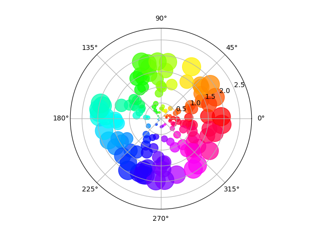
Size increases radially in this example and color increases with angle (just to verify the symbols are being scattered correctly).
import numpy as np
import matplotlib.pyplot as plt


# Fixing random state for reproducibility
np.random.seed(19680801)

# Compute areas and colors
N = 150
r = 2 * np.random.rand(N)
theta = 2 * np.pi * np.random.rand(N)
area = 200 * r**2
colors = theta

fig = plt.figure()
ax = fig.add_subplot(111, projection='polar')
c = ax.scatter(theta, r, c=colors, s=area, cmap='hsv', alpha=0.75)
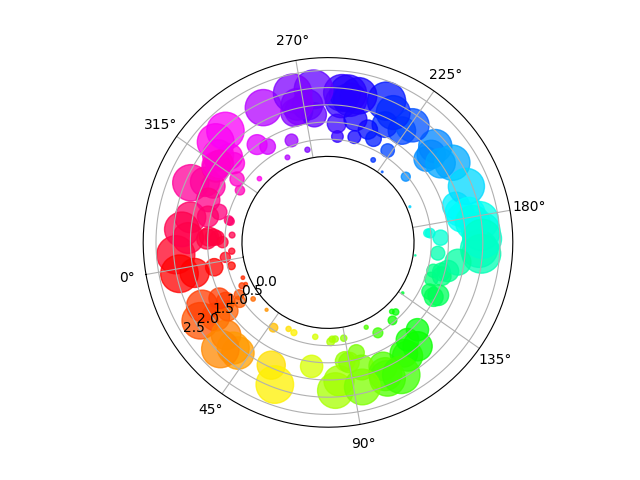
The main difference with the previous plot is the configuration of the origin radius, producing an annulus. Additionally, the theta zero location is set to rotate the plot.
fig = plt.figure()
ax = fig.add_subplot(111, polar=True)
c = ax.scatter(theta, r, c=colors, s=area, cmap='hsv', alpha=0.75)

ax.set_rorigin(-2.5)
ax.set_theta_zero_location('W', offset=10)
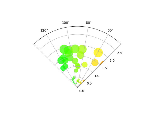
The main difference with the previous plots is the configuration of the theta start and end limits, producing a sector instead of a full circle.
fig = plt.figure()
ax = fig.add_subplot(111, polar=True)
c = ax.scatter(theta, r, c=colors, s=area, cmap='hsv', alpha=0.75)

ax.set_thetamin(45)
ax.set_thetamax(135)

plt.show()
The use of the following functions, methods, classes and modules is shown in this example:
import matplotlib
matplotlib.axes.Axes.scatter
matplotlib.pyplot.scatter
matplotlib.projections.polar
matplotlib.projections.polar.PolarAxes.set_rorigin
matplotlib.projections.polar.PolarAxes.set_theta_zero_location
matplotlib.projections.polar.PolarAxes.set_thetamin
matplotlib.projections.polar.PolarAxes.set_thetamax
Keywords: matplotlib code example, codex, python plot, pyplot Gallery generated by Sphinx-Gallery