Version 2.2.0
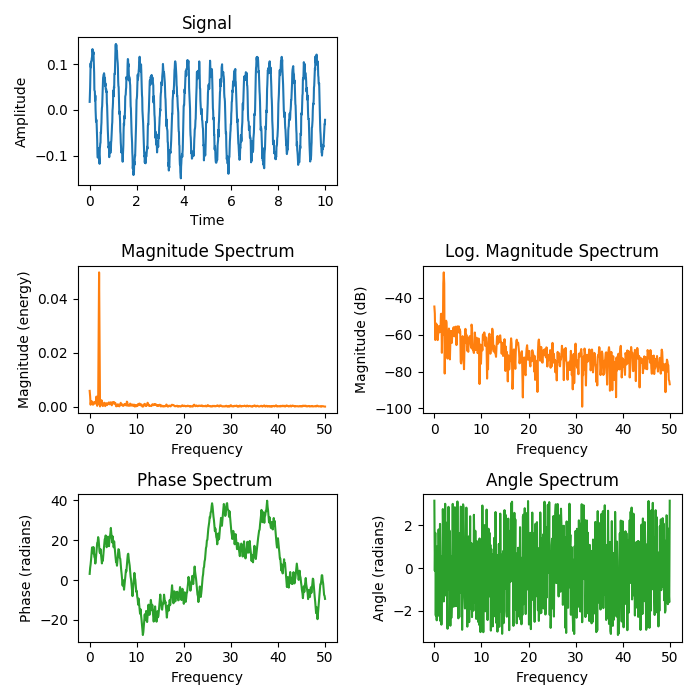
The plots show different spectrum representations of a sine signal with additive noise. A (frequency) spectrum of a discrete-time signal is calculated by utilizing the fast Fourier transform (FFT).
import matplotlib.pyplot as plt
import numpy as np


np.random.seed(0)

dt = 0.01  # sampling interval
Fs = 1 / dt  # sampling frequency
t = np.arange(0, 10, dt)

# generate noise:
nse = np.random.randn(len(t))
r = np.exp(-t / 0.05)
cnse = np.convolve(nse, r) * dt
cnse = cnse[:len(t)]

s = 0.1 * np.sin(4 * np.pi * t) + cnse  # the signal

fig, axes = plt.subplots(nrows=3, ncols=2, figsize=(7, 7))

# plot time signal:
axes[0, 0].set_title("Signal")
axes[0, 0].plot(t, s, color='C0')
axes[0, 0].set_xlabel("Time")
axes[0, 0].set_ylabel("Amplitude")

# plot different spectrum types:
axes[1, 0].set_title("Magnitude Spectrum")
axes[1, 0].magnitude_spectrum(s, Fs=Fs, color='C1')

axes[1, 1].set_title("Log. Magnitude Spectrum")
axes[1, 1].magnitude_spectrum(s, Fs=Fs, scale='dB', color='C1')

axes[2, 0].set_title("Phase Spectrum ")
axes[2, 0].phase_spectrum(s, Fs=Fs, color='C2')

axes[2, 1].set_title("Angle Spectrum")
axes[2, 1].angle_spectrum(s, Fs=Fs, color='C2')

axes[0, 1].remove()  # don't display empty ax

fig.tight_layout()
plt.show()