Version 2.1.2
Matplotlib allows you to natively plots python datetime instances, and for the most part does a good job picking tick locations and string formats. There are a couple of things it does not handle so gracefully, and here are some tricks to help you work around them. We’ll load up some sample date data which contains datetime.date objects in a numpy record array:
In [63]: datafile = cbook.get_sample_data('goog.npz')

In [64]: r = np.load(datafile)['price_data'].view(np.recarray)

In [65]: r.dtype
Out[65]: dtype([('date', '<M8[D]'), ('', '|V4'), ('open', '<f8'),
                ('high', '<f8'), ('low', '<f8'), ('close', '<f8'),
                ('volume', '<i8'),  ('adj_close', '<f8')])

In [66]: r.date
Out[66]:
array(['2004-08-19', '2004-08-20', '2004-08-23', ..., '2008-10-10',
       '2008-10-13', '2008-10-14'], dtype='datetime64[D]')
The dtype of the NumPy record array for the field date is datetime64[D]
which means it is a 64-bit np.datetime64 in ‘day’ units. While this format is
more portable, Matplotlib cannot plot this format natively yet. We can plot
this data by changing the dates to datetime.date instances instead, which can
be achieved by converting to an object array:
In [67]: r.date.astype('O')
array([datetime.date(2004, 8, 19), datetime.date(2004, 8, 20),
       datetime.date(2004, 8, 23), ..., datetime.date(2008, 10, 10),
       datetime.date(2008, 10, 13), datetime.date(2008, 10, 14)],
      dtype=object)
The dtype of this converted array is now object and it is filled with
datetime.date instances instead.
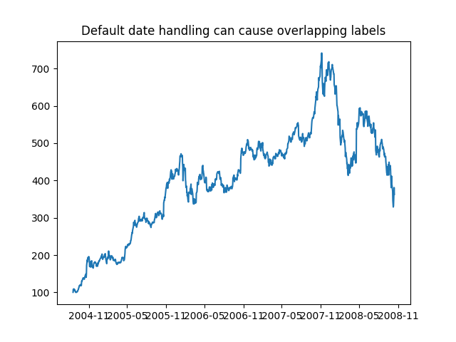
If you plot the data,
In [67]: plot(r.date.astype('O'), r.close)
Out[67]: [<matplotlib.lines.Line2D object at 0x92a6b6c>]
you will see that the x tick labels are all squashed together.
import matplotlib.cbook as cbook
import matplotlib.dates as mdates
import numpy as np
import matplotlib.pyplot as plt

with cbook.get_sample_data('goog.npz') as datafile:
    r = np.load(datafile)['price_data'].view(np.recarray)

# Matplotlib prefers datetime instead of np.datetime64.
date = r.date.astype('O')
plt.figure()
plt.plot(date, r.close)
plt.title('Default date handling can cause overlapping labels')
Another annoyance is that if you hover the mouse over the window and look in the lower right corner of the matplotlib toolbar (Interactive navigation) at the x and y coordinates, you see that the x locations are formatted the same way the tick labels are, e.g., “Dec 2004”.
What we’d like is for the location in the toolbar to have
a higher degree of precision, e.g., giving us the exact date out mouse is
hovering over. To fix the first problem, we can use
matplotlib.figure.Figure.autofmt_xdate() and to fix the second
problem we can use the ax.fmt_xdata attribute which can be set to
any function that takes a scalar and returns a string. matplotlib has
a number of date formatters built in, so we’ll use one of those.
fig, ax = plt.subplots()
ax.plot(date, r.close)

# rotate and align the tick labels so they look better
fig.autofmt_xdate()

# use a more precise date string for the x axis locations in the
# toolbar
ax.fmt_xdata = mdates.DateFormatter('%Y-%m-%d')
ax.set_title('fig.autofmt_xdate fixes the labels')
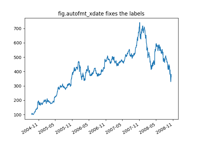
Now when you hover your mouse over the plotted data, you’ll see date format strings like 2004-12-01 in the toolbar.
Total running time of the script: ( 0 minutes 0.045 seconds)
