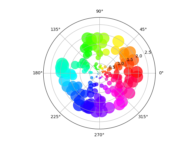
Size increases radially in this example and color increases with angle (just to verify the symbols are being scattered correctly).
import numpy as np
import matplotlib.pyplot as plt


# Fixing random state for reproducibility
np.random.seed(19680801)

# Compute areas and colors
N = 150
r = 2 * np.random.rand(N)
theta = 2 * np.pi * np.random.rand(N)
area = 200 * r**2
colors = theta

fig = plt.figure()
ax = fig.add_subplot(111, projection='polar')
c = ax.scatter(theta, r, c=colors, s=area, cmap='hsv', alpha=0.75)
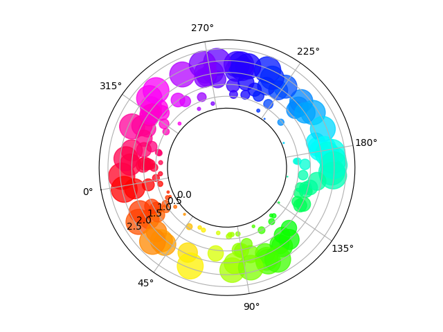
The main difference with the previous plot is the configuration of the origin radius, producing an annulus. Additionally, the theta zero location is set to rotate the plot.
fig = plt.figure()
ax = fig.add_subplot(111, polar=True)
c = ax.scatter(theta, r, c=colors, s=area, cmap='hsv', alpha=0.75)

ax.set_rorigin(-2.5)
ax.set_theta_zero_location('W', offset=10)
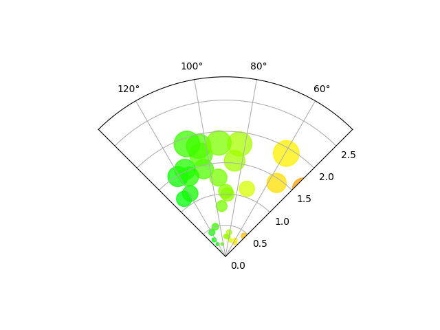
The main difference with the previous plots is the configuration of the theta start and end limits, producing a sector instead of a full circle.
fig = plt.figure()
ax = fig.add_subplot(111, polar=True)
c = ax.scatter(theta, r, c=colors, s=area, cmap='hsv', alpha=0.75)

ax.set_thetamin(45)
ax.set_thetamax(135)

plt.show()
Total running time of the script: ( 0 minutes 0.040 seconds)
