

"""
Illustrate simple contour plotting, contours on an image with
a colorbar for the contours, and labelled contours.
See also contour_image.py.
"""
import matplotlib
import numpy as np
import matplotlib.cm as cm
import matplotlib.mlab as mlab
import matplotlib.pyplot as plt
matplotlib.rcParams['xtick.direction'] = 'out'
matplotlib.rcParams['ytick.direction'] = 'out'
delta = 0.025
x = np.arange(-3.0, 3.0, delta)
y = np.arange(-2.0, 2.0, delta)
X, Y = np.meshgrid(x, y)
Z1 = mlab.bivariate_normal(X, Y, 1.0, 1.0, 0.0, 0.0)
Z2 = mlab.bivariate_normal(X, Y, 1.5, 0.5, 1, 1)
# difference of Gaussians
Z = 10.0 * (Z2 - Z1)
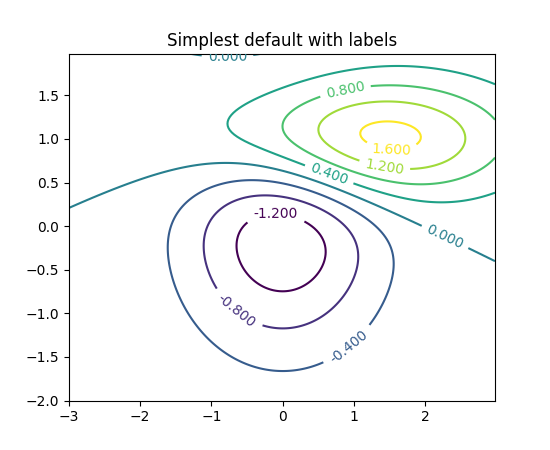
# Create a simple contour plot with labels using default colors. The
# inline argument to clabel will control whether the labels are draw
# over the line segments of the contour, removing the lines beneath
# the label
plt.figure()
CS = plt.contour(X, Y, Z)
plt.clabel(CS, inline=1, fontsize=10)
plt.title('Simplest default with labels')
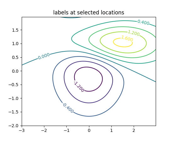
# contour labels can be placed manually by providing list of positions
# (in data coordinate). See ginput_manual_clabel.py for interactive
# placement.
plt.figure()
CS = plt.contour(X, Y, Z)
manual_locations = [(-1, -1.4), (-0.62, -0.7), (-2, 0.5), (1.7, 1.2), (2.0, 1.4), (2.4, 1.7)]
plt.clabel(CS, inline=1, fontsize=10, manual=manual_locations)
plt.title('labels at selected locations')
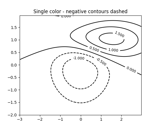
# You can force all the contours to be the same color.
plt.figure()
CS = plt.contour(X, Y, Z, 6,
colors='k', # negative contours will be dashed by default
)
plt.clabel(CS, fontsize=9, inline=1)
plt.title('Single color - negative contours dashed')
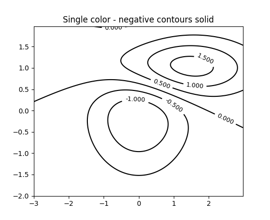
# You can set negative contours to be solid instead of dashed:
matplotlib.rcParams['contour.negative_linestyle'] = 'solid'
plt.figure()
CS = plt.contour(X, Y, Z, 6,
colors='k', # negative contours will be dashed by default
)
plt.clabel(CS, fontsize=9, inline=1)
plt.title('Single color - negative contours solid')
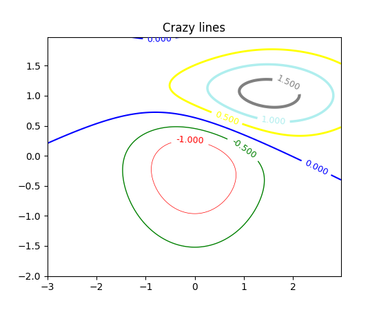
# And you can manually specify the colors of the contour
plt.figure()
CS = plt.contour(X, Y, Z, 6,
linewidths=np.arange(.5, 4, .5),
colors=('r', 'green', 'blue', (1, 1, 0), '#afeeee', '0.5')
)
plt.clabel(CS, fontsize=9, inline=1)
plt.title('Crazy lines')
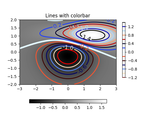
# Or you can use a colormap to specify the colors; the default
# colormap will be used for the contour lines
plt.figure()
im = plt.imshow(Z, interpolation='bilinear', origin='lower',
cmap=cm.gray, extent=(-3, 3, -2, 2))
levels = np.arange(-1.2, 1.6, 0.2)
CS = plt.contour(Z, levels,
origin='lower',
linewidths=2,
extent=(-3, 3, -2, 2))
# Thicken the zero contour.
zc = CS.collections[6]
plt.setp(zc, linewidth=4)
plt.clabel(CS, levels[1::2], # label every second level
inline=1,
fmt='%1.1f',
fontsize=14)
# make a colorbar for the contour lines
CB = plt.colorbar(CS, shrink=0.8, extend='both')
plt.title('Lines with colorbar')
#plt.hot() # Now change the colormap for the contour lines and colorbar
plt.flag()
# We can still add a colorbar for the image, too.
CBI = plt.colorbar(im, orientation='horizontal', shrink=0.8)
# This makes the original colorbar look a bit out of place,
# so let's improve its position.
l, b, w, h = plt.gca().get_position().bounds
ll, bb, ww, hh = CB.ax.get_position().bounds
CB.ax.set_position([ll, b + 0.1*h, ww, h*0.8])
plt.show()
Keywords: python, matplotlib, pylab, example, codex (see Search examples)

