

(Source code, png, hires.png, pdf)

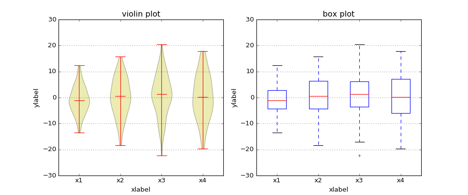
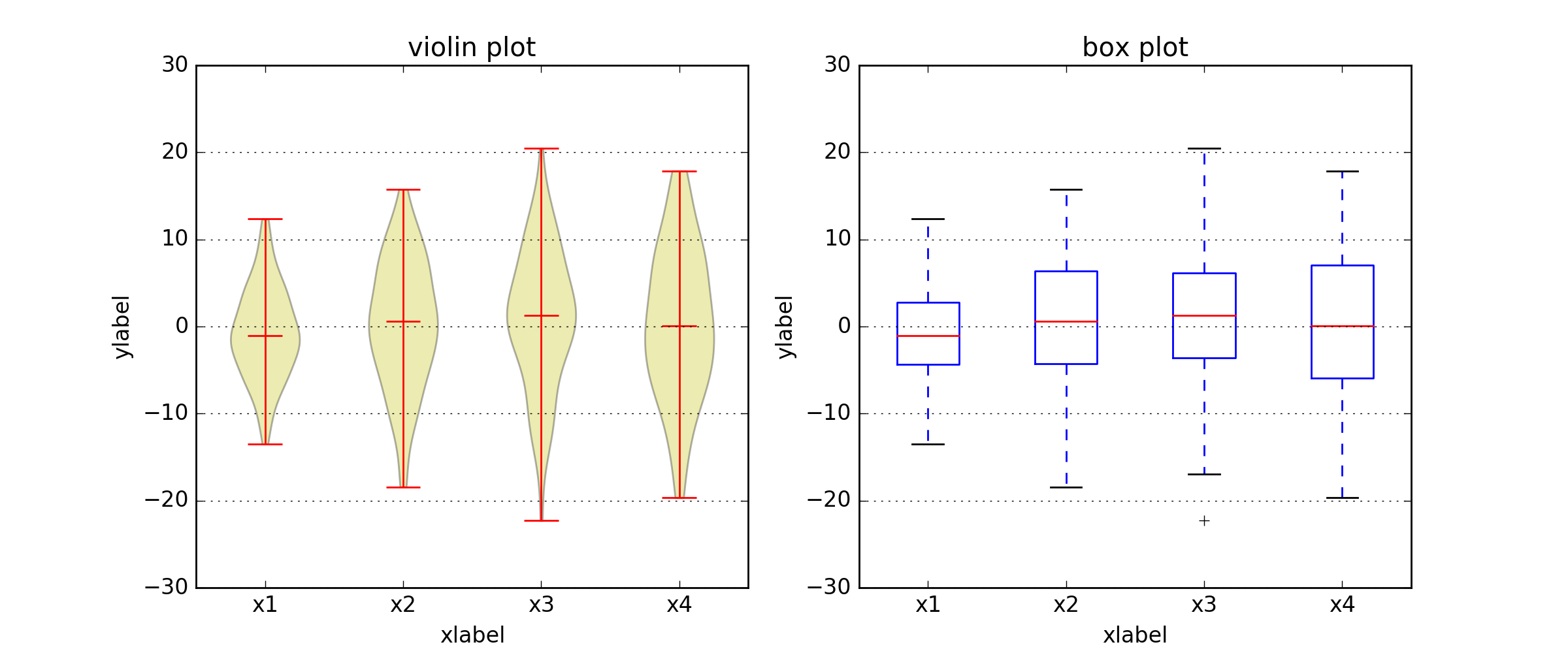
# Box plot - violin plot comparison
#
# Note that although violin plots are closely related to Tukey's (1977) box plots,
# they add useful information such as the distribution of the sample data (density trace).
#
# By default, box plots show data points outside 1.5 x the inter-quartile range as outliers
# above or below the whiskers wheras violin plots show the whole range of the data.
#
# Violin plots require matplotlib >= 1.4.

import matplotlib.pyplot as plt
import numpy as np

fig, axes = plt.subplots(nrows=1, ncols=2, figsize=(12, 5))

# generate some random test data
all_data = [np.random.normal(0, std, 100) for std in range(6, 10)]

# plot violin plot
axes[0].violinplot(all_data,
                   showmeans=False,
                   showmedians=True)
axes[0].set_title('violin plot')

# plot box plot
axes[1].boxplot(all_data)
axes[1].set_title('box plot')

# adding horizontal grid lines
for ax in axes:
    ax.yaxis.grid(True)
    ax.set_xticks([y+1 for y in range(len(all_data))])
    ax.set_xlabel('xlabel')
    ax.set_ylabel('ylabel')

# add x-tick labels
plt.setp(axes, xticks=[y+1 for y in range(len(all_data))],
         xticklabels=['x1', 'x2', 'x3', 'x4'])
plt.show()
Keywords: python, matplotlib, pylab, example, codex (see Search examples)