

(Source code, png, hires.png, pdf)
import matplotlib.pyplot as plt
from matplotlib.mlab import csv2rec
from matplotlib.cbook import get_sample_data
fname = get_sample_data('percent_bachelors_degrees_women_usa.csv')
gender_degree_data = csv2rec(fname)
# These are the colors that will be used in the plot
color_sequence = ['#1f77b4', '#aec7e8', '#ff7f0e', '#ffbb78', '#2ca02c',
'#98df8a', '#d62728', '#ff9896', '#9467bd', '#c5b0d5',
'#8c564b', '#c49c94', '#e377c2', '#f7b6d2', '#7f7f7f',
'#c7c7c7', '#bcbd22', '#dbdb8d', '#17becf', '#9edae5']
# You typically want your plot to be ~1.33x wider than tall. This plot
# is a rare exception because of the number of lines being plotted on it.
# Common sizes: (10, 7.5) and (12, 9)
fig, ax = plt.subplots(1, 1, figsize=(12, 14))
# Remove the plot frame lines. They are unnecessary here.
ax.spines['top'].set_visible(False)
ax.spines['bottom'].set_visible(False)
ax.spines['right'].set_visible(False)
ax.spines['left'].set_visible(False)
# Ensure that the axis ticks only show up on the bottom and left of the plot.
# Ticks on the right and top of the plot are generally unnecessary.
ax.get_xaxis().tick_bottom()
ax.get_yaxis().tick_left()
# Limit the range of the plot to only where the data is.
# Avoid unnecessary whitespace.
plt.xlim(1968.5, 2011.1)
plt.ylim(-0.25, 90)
# Make sure your axis ticks are large enough to be easily read.
# You don't want your viewers squinting to read your plot.
plt.xticks(range(1970, 2011, 10), fontsize=14)
plt.yticks(range(0, 91, 10), ['{0}%'.format(x)
for x in range(0, 91, 10)], fontsize=14)
# Provide tick lines across the plot to help your viewers trace along
# the axis ticks. Make sure that the lines are light and small so they
# don't obscure the primary data lines.
for y in range(10, 91, 10):
plt.plot(range(1969, 2012), [y] * len(range(1969, 2012)), '--',
lw=0.5, color='black', alpha=0.3)
# Remove the tick marks; they are unnecessary with the tick lines we just
# plotted.
plt.tick_params(axis='both', which='both', bottom='off', top='off',
labelbottom='on', left='off', right='off', labelleft='on')
# Now that the plot is prepared, it's time to actually plot the data!
# Note that I plotted the majors in order of the highest % in the final year.
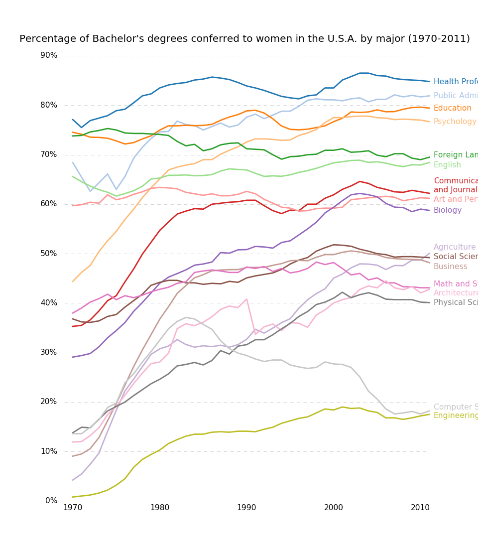
majors = ['Health Professions', 'Public Administration', 'Education',
'Psychology', 'Foreign Languages', 'English',
'Communications\nand Journalism', 'Art and Performance', 'Biology',
'Agriculture', 'Social Sciences and History', 'Business',
'Math and Statistics', 'Architecture', 'Physical Sciences',
'Computer Science', 'Engineering']
y_offsets = {'Foreign Languages': 0.5, 'English': -0.5,
'Communications\nand Journalism': 0.75,
'Art and Performance': -0.25, 'Agriculture': 1.25,
'Social Sciences and History': 0.25, 'Business': -0.75,
'Math and Statistics': 0.75, 'Architecture': -0.75,
'Computer Science': 0.75, 'Engineering': -0.25}
for rank, column in enumerate(majors):
# Plot each line separately with its own color.
column_rec_name = column.replace('\n', '_').replace(' ', '_').lower()
line = plt.plot(gender_degree_data.year,
gender_degree_data[column_rec_name],
lw=2.5,
color=color_sequence[rank])
# Add a text label to the right end of every line. Most of the code below
# is adding specific offsets y position because some labels overlapped.
y_pos = gender_degree_data[column_rec_name][-1] - 0.5
if column in y_offsets:
y_pos += y_offsets[column]
# Again, make sure that all labels are large enough to be easily read
# by the viewer.
plt.text(2011.5, y_pos, column, fontsize=14, color=color_sequence[rank])
# Make the title big enough so it spans the entire plot, but don't make it
# so big that it requires two lines to show.
# Note that if the title is descriptive enough, it is unnecessary to include
# axis labels; they are self-evident, in this plot's case.
plt.title('Percentage of Bachelor\'s degrees conferred to women in '
'the U.S.A. by major (1970-2011)\n', fontsize=18, ha='center')
# Finally, save the figure as a PNG.
# You can also save it as a PDF, JPEG, etc.
# Just change the file extension in this call.
plt.savefig('percent-bachelors-degrees-women-usa.png', bbox_inches='tight')
Keywords: python, matplotlib, pylab, example, codex (see Search examples)