Learn what to expect in the new updates

The idea behind choosing a good colormap is to find a good representation in 3D colorspace for your data set. The best colormap for any given data set depends on many things including:
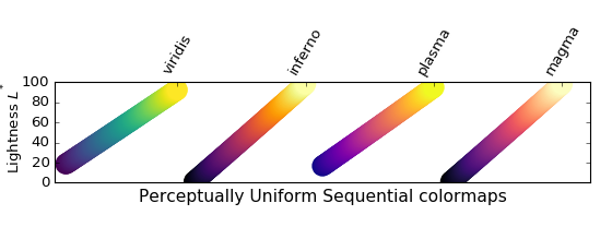
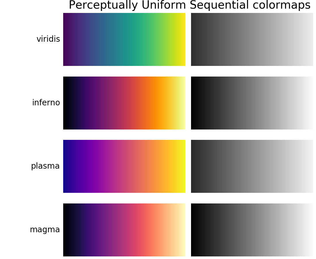
For many applications, a perceptually uniform colormap is the best choice — one in which equal steps in data are perceived as equal steps in the color space. Researchers have found that the human brain perceives changes in the lightness parameter as changes in the data much better than, for example, changes in hue. Therefore, colormaps which have monotonically increasing lightness through the colormap will be better interpreted by the viewer.
Color can be represented in 3D space in various ways. One way to represent color
is using CIELAB. In CIELAB, color space is represented by lightness,
 ; red-green,
  ; and yellow-blue,
  . The lightness
parameter can then be used to learn more about how the matplotlib
colormaps will be perceived by viewers.
. The lightness
parameter can then be used to learn more about how the matplotlib
colormaps will be perceived by viewers.
An excellent starting resource for learning about human perception of colormaps is from [IBM].
Colormaps are often split into several categories based on their function (see, e.g., [Moreland]):
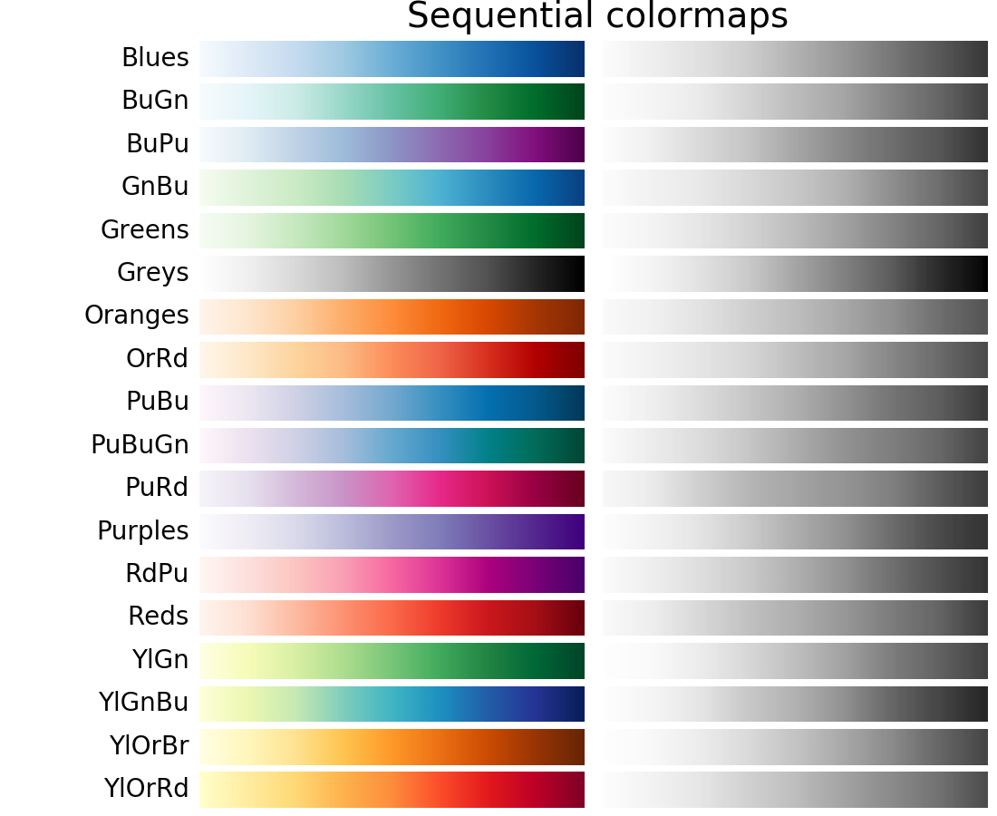
Here we examine the lightness values of the matplotlib colormaps. Note that some documentation on the colormaps is available ([list-colormaps]).
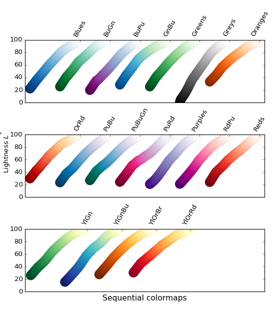
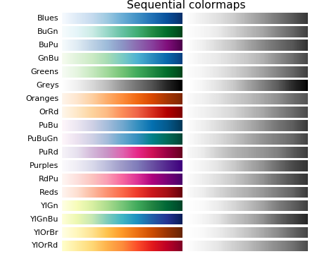
For the Sequential plots, the lightness value increases monotonically through
the colormaps. This is good. Some of the values in the colormaps
span from 0 to 100 (binary and the other grayscale), and others start around
 . Those that have a smaller range of will accordingly
have a smaller perceptual range. Note also that the function varies
amongst the colormaps: some are approximately linear in and others
are more curved.
. Those that have a smaller range of will accordingly
have a smaller perceptual range. Note also that the function varies
amongst the colormaps: some are approximately linear in and others
are more curved.
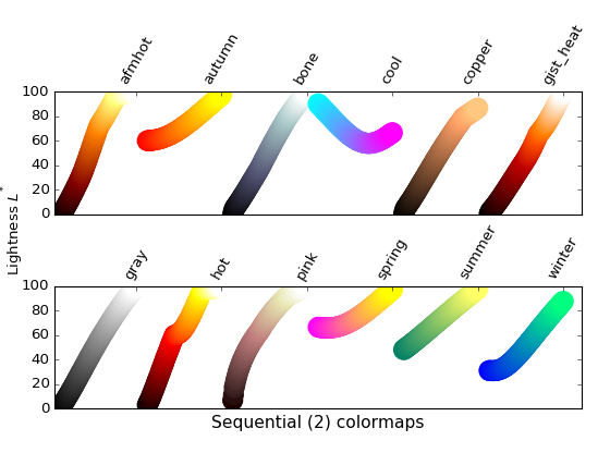
Many of the values from the Sequential2 plots are monotonically
increasing, but some (autumn, cool, spring, and winter) plateau or even go both
up and down in space. Others (afmhot, copper, gist_heat, and hot)
have kinks in the functions. Data that is being represented in a
region of the colormap that is at a plateau or kink will lead to a perception of
banding of the data in those values in the colormap (see [mycarta-banding] for
an excellent example of this).
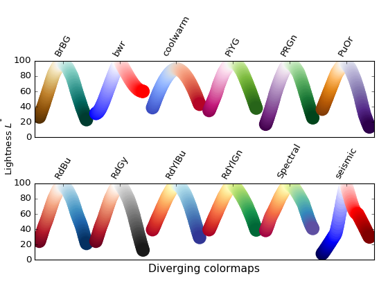
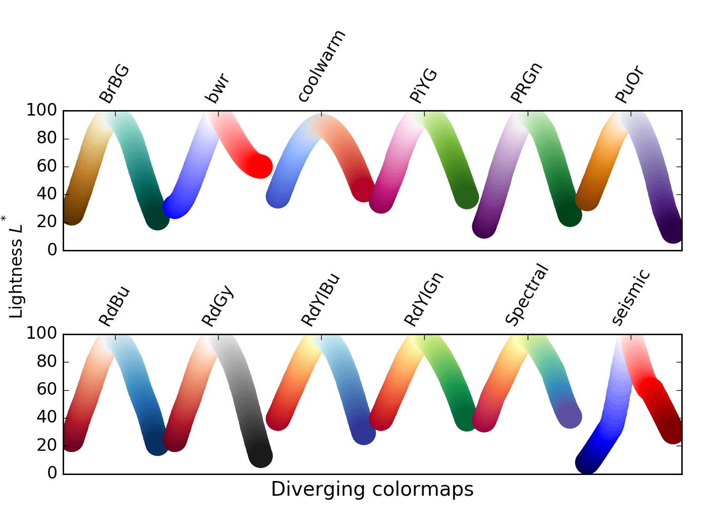
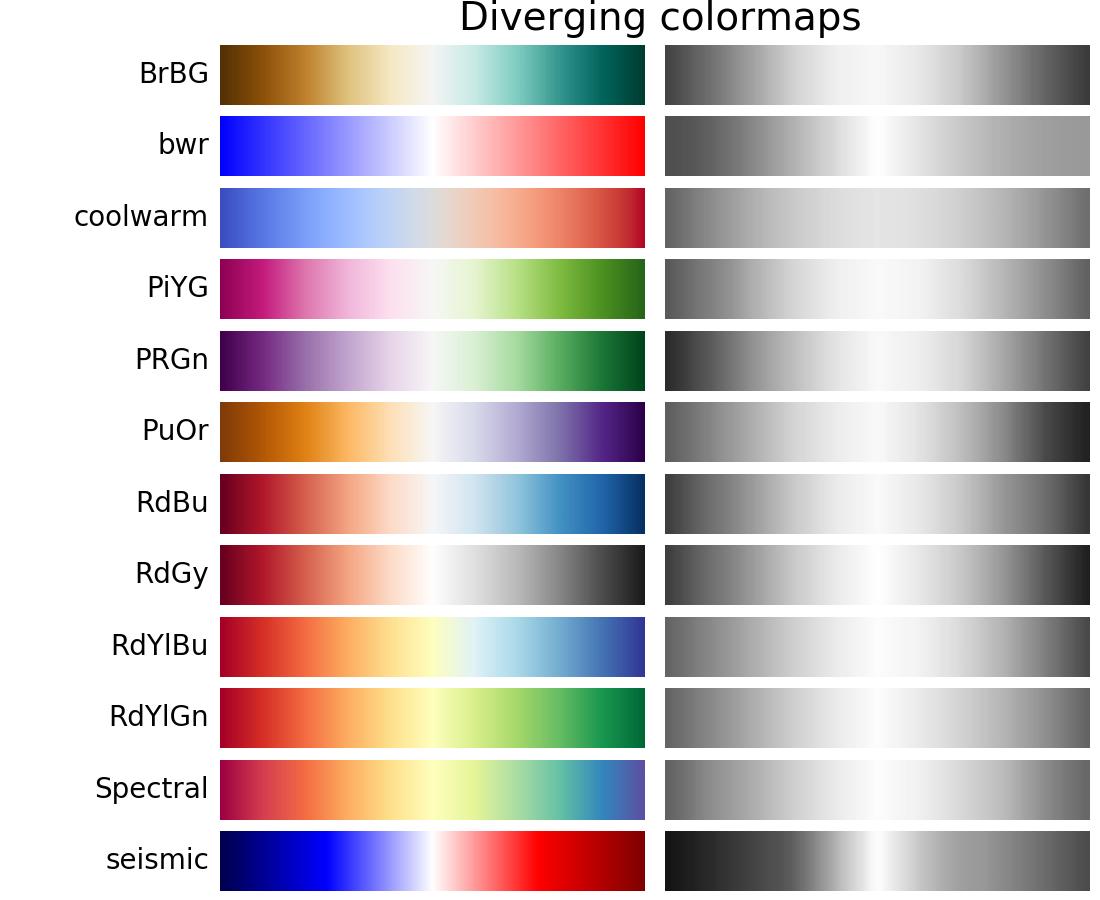
For the Diverging maps, we want to have monotonically increasing
values up to a maximum, which should be close to  , followed by
monotonically decreasing values. We are looking for approximately
equal minimum values at opposite ends of the colormap. By these
measures, BrBG and RdBu are good options. coolwarm is a good option, but it
doesn’t span a wide range of values (see grayscale section below).
, followed by
monotonically decreasing values. We are looking for approximately
equal minimum values at opposite ends of the colormap. By these
measures, BrBG and RdBu are good options. coolwarm is a good option, but it
doesn’t span a wide range of values (see grayscale section below).
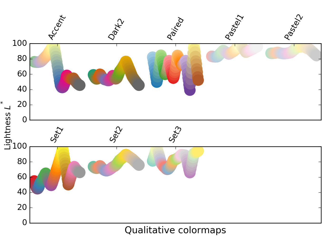
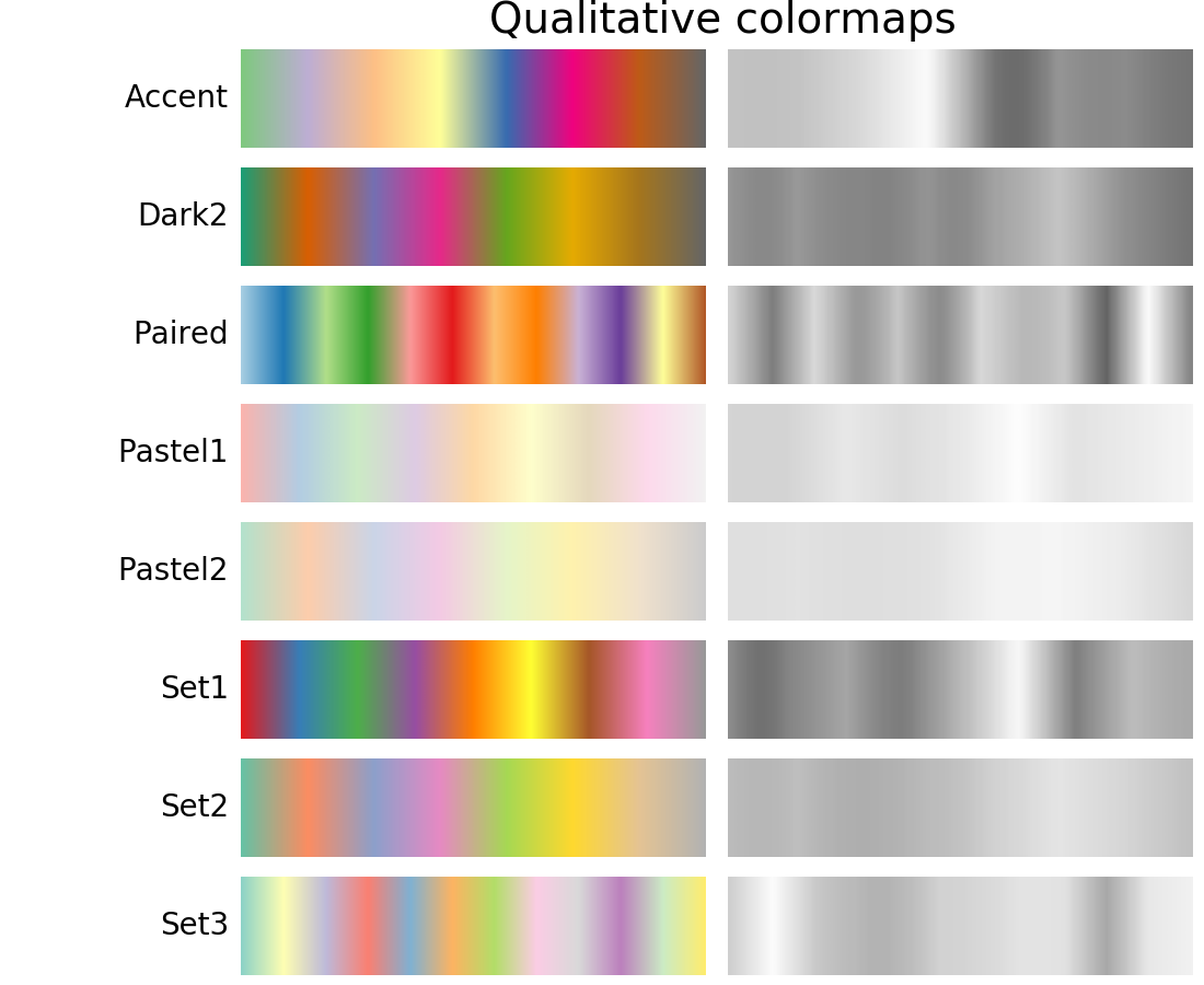
Qualitative colormaps are not aimed at being perceptual maps, but looking at the
lightness parameter can verify that for us. The values move all over
the place throughout the colormap, and are clearly not monotonically increasing.
These would not be good options for use as perceptual colormaps.
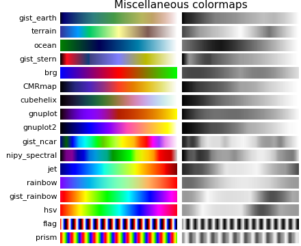
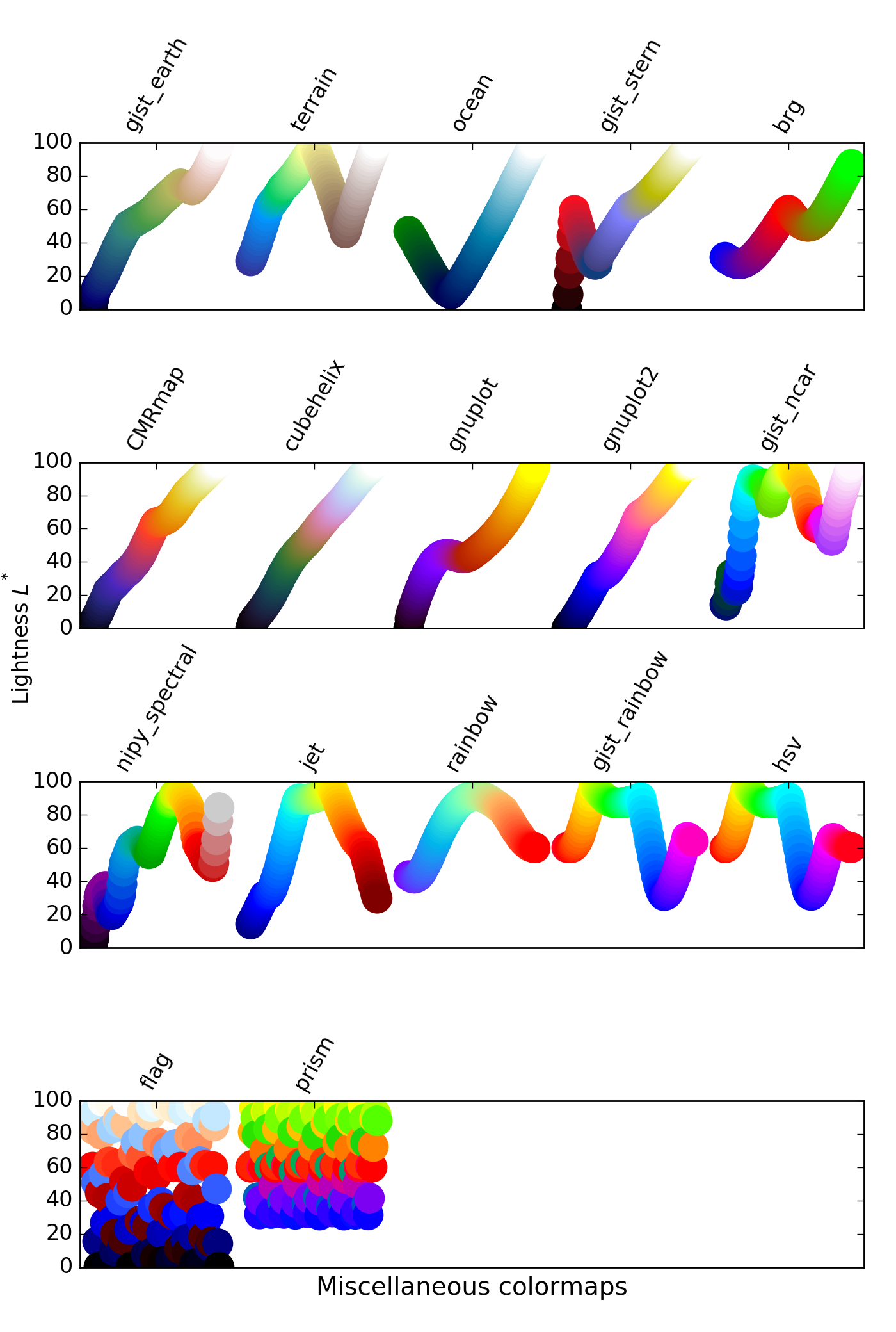
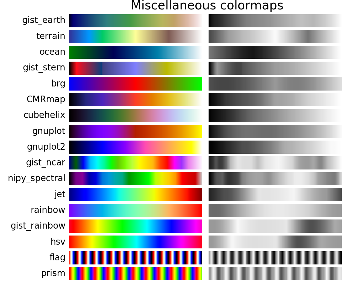
Some of the miscellaneous colormaps have particular uses for which
they have been created. For example, gist_earth, ocean, and terrain
all seem to be created for plotting topography (green/brown) and water
depths (blue) together. We would expect to see a divergence in these
colormaps, then, but multiple kinks may not be ideal, such as in
gist_earth and terrain. CMRmap was created to convert well to
grayscale, though it does appear to have some small kinks in
. cubehelix was created to vary smoothly in both lightness
and hue, but appears to have a small hump in the green hue area.
The often-used jet colormap is included in this set of colormaps. We can see
that the values vary widely throughout the colormap, making it a
poor choice for representing data for viewers to see perceptually. See an
extension on this idea at [mycarta-jet].
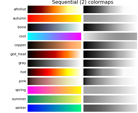
It is important to pay attention to conversion to grayscale for color plots, since they may be printed on black and white printers. If not carefully considered, your readers may end up with indecipherable plots because the grayscale changes unpredictably through the colormap.
Conversion to grayscale is done in many different ways [bw]. Some of the better
ones use a linear combination of the rgb values of a pixel, but weighted
according to how we perceive color intensity. A nonlinear method of conversion
to grayscale is to use the values of the pixels. In general, similar
principles apply for this question as they do for presenting one’s information
perceptually; that is, if a colormap is chosen that is monotonically increasing
in values, it will print in a reasonable manner to grayscale.
With this in mind, we see that the Sequential colormaps have reasonable representations in grayscale. Some of the Sequential2 colormaps have decent enough grayscale representations, though some (autumn, spring, summer, winter) have very little grayscale change. If a colormap like this was used in a plot and then the plot was printed to grayscale, a lot of the information may map to the same gray values. The Diverging colormaps mostly vary from darker gray on the outer edges to white in the middle. Some (PuOr and seismic) have noticably darker gray on one side than the other and therefore are not very symmetric. coolwarm has little range of gray scale and would print to a more uniform plot, losing a lot of detail. Note that overlaid, labeled contours could help differentiate between one side of the colormap vs. the other since color cannot be used once a plot is printed to grayscale. Many of the Qualitative and Miscellaneous colormaps, such as Accent, hsv, and jet, change from darker to lighter and back to darker gray throughout the colormap. This would make it impossible for a viewer to interpret the information in a plot once it is printed in grayscale.
There is a lot of information available about color blindness (e.g., [colorblindness]). Additionally, there are tools available to convert images to how they look for different types of color vision deficiencies (e.g., [asp]).
The most common form of color vision deficiency involves differentiating between red and green. Thus, avoiding colormaps with both red and green will avoid many problems in general.
| [Ware] | http://ccom.unh.edu/sites/default/files/publications/Ware_1988_CGA_Color_sequences_univariate_maps.pdf |
| [Moreland] | http://www.sandia.gov/~kmorel/documents/ColorMaps/ColorMapsExpanded.pdf |
| [list-colormaps] | https://gist.github.com/endolith/2719900#id7 |
| [mycarta-banding] | http://mycarta.wordpress.com/2012/10/14/the-rainbow-is-deadlong-live-the-rainbow-part-4-cie-lab-heated-body/ |
| [mycarta-jet] | http://mycarta.wordpress.com/2012/10/06/the-rainbow-is-deadlong-live-the-rainbow-part-3/ |
| [mycarta-lablinear] | http://mycarta.wordpress.com/2012/12/06/the-rainbow-is-deadlong-live-the-rainbow-part-5-cie-lab-linear-l-rainbow/ |
| [mycarta-cubelaw] | http://mycarta.wordpress.com/2013/02/21/perceptual-rainbow-palette-the-method/ |
| [bw] | http://www.tannerhelland.com/3643/grayscale-image-algorithm-vb6/ |
| [colorblindness] | http://aspnetresources.com/tools/colorBlindness |
| [asp] | http://aspnetresources.com/tools/colorBlindness |
| [IBM] | http://www.research.ibm.com/people/l/lloydt/color/color.HTM |


