Learn what to expect in the new updates

Like any graphics packages, matplotlib is built on top of a transformation framework to easily move between coordinate systems, the userland data coordinate system, the axes coordinate system, the figure coordinate system, and the display coordinate system. In 95% of your plotting, you won’t need to think about this, as it happens under the hood, but as you push the limits of custom figure generation, it helps to have an understanding of these objects so you can reuse the existing transformations matplotlib makes available to you, or create your own (see matplotlib.transforms). The table below summarizes the existing coordinate systems, the transformation object you should use to work in that coordinate system, and the description of that system. In the Transformation Object column, ax is a Axes instance, and fig is a Figure instance.
| Coordinate | Transformation Object | Description |
|---|---|---|
| data | ax.transData | The userland data coordinate system, controlled by the xlim and ylim |
| axes | ax.transAxes | The coordinate system of the Axes; (0,0) is bottom left of the axes, and (1,1) is top right of the axes. |
| figure | fig.transFigure | The coordinate system of the Figure; (0,0) is bottom left of the figure, and (1,1) is top right of the figure. |
| display | None | This is the pixel coordinate system of the display; (0,0) is the bottom left of the display, and (width, height) is the top right of the display in pixels. Alternatively, the identity transform (matplotlib.transforms.IdentityTransform()) may be used instead of None. |
All of the transformation objects in the table above take inputs in their coordinate system, and transform the input to the display coordinate system. That is why the display coordinate system has None for the Transformation Object column – it already is in display coordinates. The transformations also know how to invert themselves, to go from display back to the native coordinate system. This is particularly useful when processing events from the user interface, which typically occur in display space, and you want to know where the mouse click or key-press occurred in your data coordinate system.
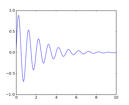
Let’s start with the most commonly used coordinate, the data coordinate system. Whenever you add data to the axes, matplotlib updates the datalimits, most commonly updated with the set_xlim() and set_ylim() methods. For example, in the figure below, the data limits stretch from 0 to 10 on the x-axis, and -1 to 1 on the y-axis.
import numpy as np
import matplotlib.pyplot as plt

x = np.arange(0, 10, 0.005)
y = np.exp(-x/2.) * np.sin(2*np.pi*x)

fig = plt.figure()
ax = fig.add_subplot(111)
ax.plot(x, y)
ax.set_xlim(0, 10)
ax.set_ylim(-1, 1)

plt.show()
(Source code, png, hires.png, pdf)

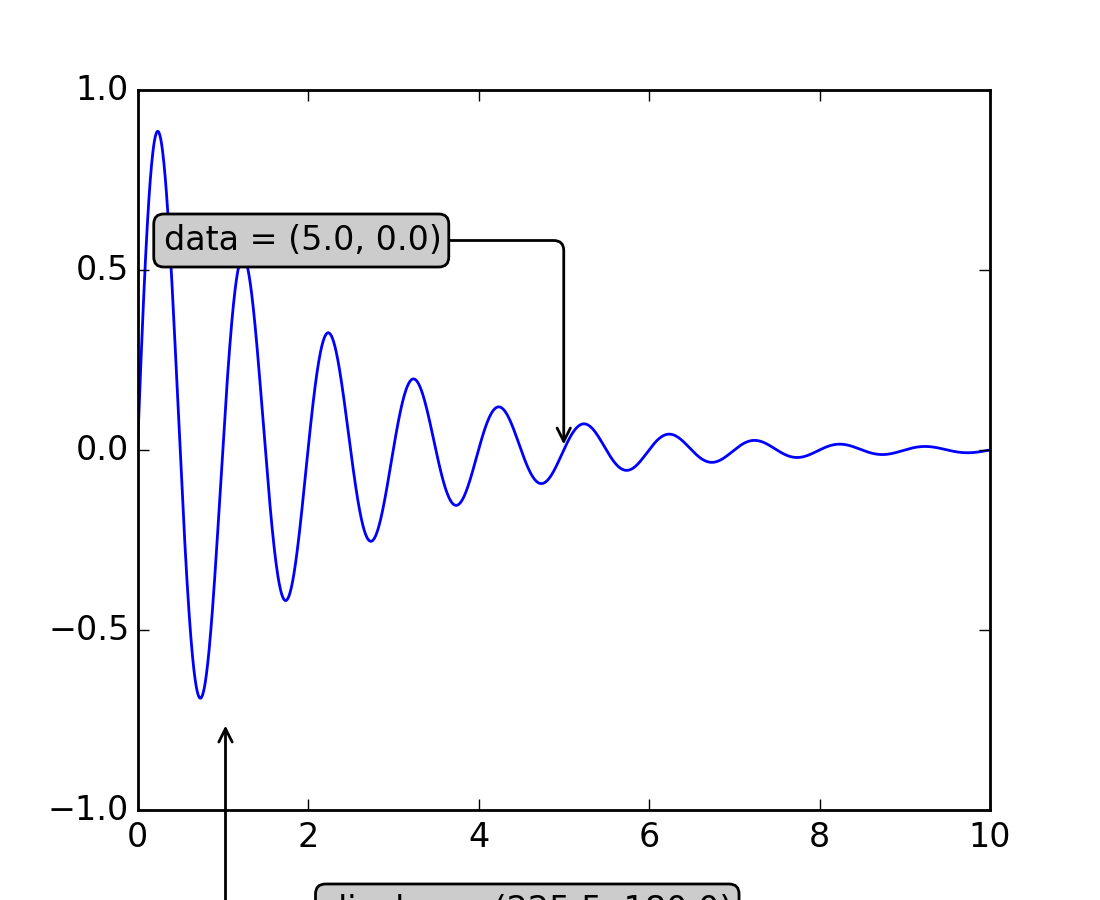
You can use the ax.transData instance to transform from your data to your display coordinate system, either a single point or a sequence of points as shown below:
In [14]: type(ax.transData)
Out[14]: <class 'matplotlib.transforms.CompositeGenericTransform'>

In [15]: ax.transData.transform((5, 0))
Out[15]: array([ 335.175,  247.   ])

In [16]: ax.transData.transform([(5, 0), (1,2)])
Out[16]:
array([[ 335.175,  247.   ],
       [ 132.435,  642.2  ]])
You can use the inverted() method to create a transform which will take you from display to data coordinates:
In [41]: inv = ax.transData.inverted()

In [42]: type(inv)
Out[42]: <class 'matplotlib.transforms.CompositeGenericTransform'>

In [43]: inv.transform((335.175,  247.))
Out[43]: array([ 5.,  0.])
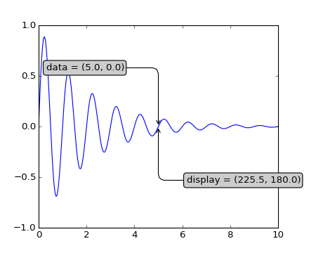
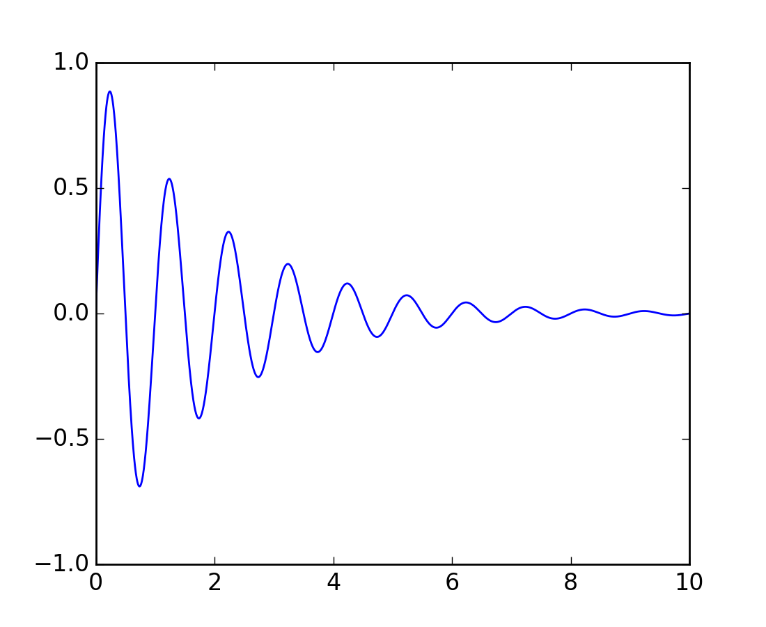
If your are typing along with this tutorial, the exact values of the display coordinates may differ if you have a different window size or dpi setting. Likewise, in the figure below, the display labeled points are probably not the same as in the ipython session because the documentation figure size defaults are different.
(Source code, png, hires.png, pdf)
Note
If you run the source code in the example above in a GUI backend, you may also find that the two arrows for the data and display annotations do not point to exactly the same point. This is because the display point was computed before the figure was displayed, and the GUI backend may slightly resize the figure when it is created. The effect is more pronounced if you resize the figure yourself. This is one good reason why you rarely want to work in display space, but you can connect to the 'on_draw' Event to update figure coordinates on figure draws; see Event handling and picking.
When you change the x or y limits of your axes, the data limits are updated so the transformation yields a new display point. Note that when we just change the ylim, only the y-display coordinate is altered, and when we change the xlim too, both are altered. More on this later when we talk about the Bbox.
In [54]: ax.transData.transform((5, 0))
Out[54]: array([ 335.175,  247.   ])

In [55]: ax.set_ylim(-1,2)
Out[55]: (-1, 2)

In [56]: ax.transData.transform((5, 0))
Out[56]: array([ 335.175     ,  181.13333333])

In [57]: ax.set_xlim(10,20)
Out[57]: (10, 20)

In [58]: ax.transData.transform((5, 0))
Out[58]: array([-171.675     ,  181.13333333])
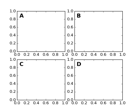
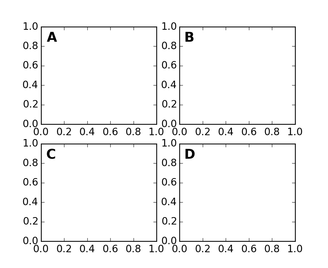
After the data coordinate system, axes is probably the second most useful coordinate system. Here the point (0,0) is the bottom left of your axes or subplot, (0.5, 0.5) is the center, and (1.0, 1.0) is the top right. You can also refer to points outside the range, so (-0.1, 1.1) is to the left and above your axes. This coordinate system is extremely useful when placing text in your axes, because you often want a text bubble in a fixed, location, e.g., the upper left of the axes pane, and have that location remain fixed when you pan or zoom. Here is a simple example that creates four panels and labels them ‘A’, ‘B’, ‘C’, ‘D’ as you often see in journals.
import numpy as np
import matplotlib.pyplot as plt

fig = plt.figure()
for i, label in enumerate(('A', 'B', 'C', 'D')):
    ax = fig.add_subplot(2,2,i+1)
    ax.text(0.05, 0.95, label, transform=ax.transAxes,
      fontsize=16, fontweight='bold', va='top')

plt.show()
(Source code, png, hires.png, pdf)
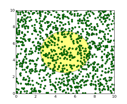
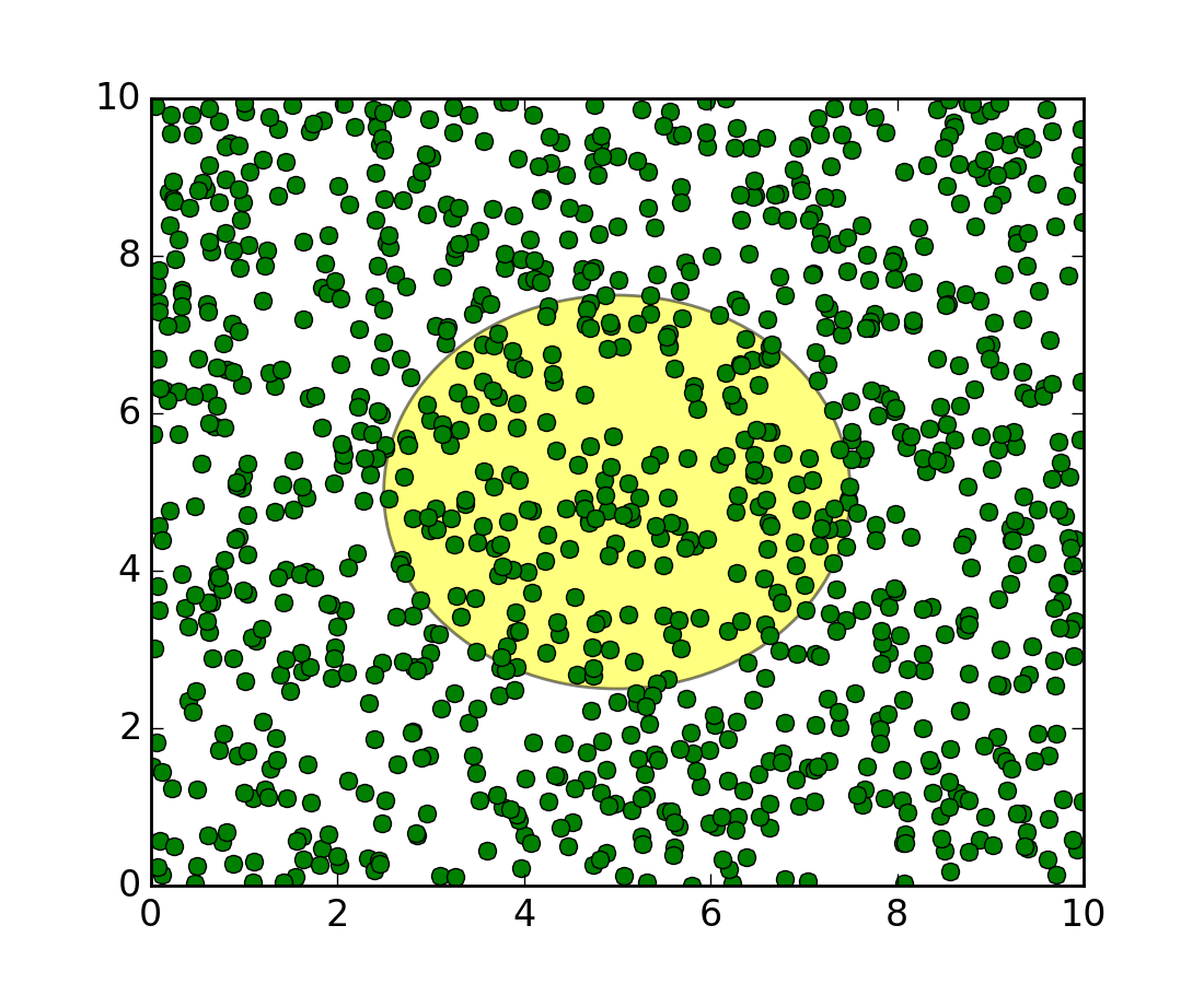
You can also make lines or patches in the axes coordinate system, but this is less useful in my experience than using ax.transAxes for placing text. Nonetheless, here is a silly example which plots some random dots in data space, and overlays a semi-transparent Circle centered in the middle of the axes with a radius one quarter of the axes – if your axes does not preserve aspect ratio (see set_aspect()), this will look like an ellipse. Use the pan/zoom tool to move around, or manually change the data xlim and ylim, and you will see the data move, but the circle will remain fixed because it is not in data coordinates and will always remain at the center of the axes.
import numpy as np
import matplotlib.pyplot as plt
import matplotlib.patches as patches
fig = plt.figure()
ax = fig.add_subplot(111)
x, y = 10*np.random.rand(2, 1000)
ax.plot(x, y, 'go')  # plot some data in data coordinates

circ = patches.Circle((0.5, 0.5), 0.25, transform=ax.transAxes,
                      facecolor='yellow', alpha=0.5)
ax.add_patch(circ)

plt.show()
(Source code, png, hires.png, pdf)

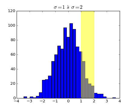
Drawing in blended coordinate spaces which mix axes with data coordinates is extremely useful, for example to create a horizontal span which highlights some region of the y-data but spans across the x-axis regardless of the data limits, pan or zoom level, etc. In fact these blended lines and spans are so useful, we have built in functions to make them easy to plot (see axhline(), axvline(), axhspan(), axvspan()) but for didactic purposes we will implement the horizontal span here using a blended transformation. This trick only works for separable transformations, like you see in normal Cartesian coordinate systems, but not on inseparable transformations like the PolarTransform.
import numpy as np
import matplotlib.pyplot as plt
import matplotlib.patches as patches
import matplotlib.transforms as transforms

fig = plt.figure()
ax = fig.add_subplot(111)

x = np.random.randn(1000)

ax.hist(x, 30)
ax.set_title(r'$\sigma=1 \/ \dots \/ \sigma=2$', fontsize=16)

# the x coords of this transformation are data, and the
# y coord are axes
trans = transforms.blended_transform_factory(
    ax.transData, ax.transAxes)

# highlight the 1..2 stddev region with a span.
# We want x to be in data coordinates and y to
# span from 0..1 in axes coords
rect = patches.Rectangle((1,0), width=1, height=1,
                         transform=trans, color='yellow',
                         alpha=0.5)

ax.add_patch(rect)

plt.show()
(Source code, png, hires.png, pdf)
Note
The blended transformations where x is in data coords and y in axes coordinates is so useful that we have helper methods to return the versions mpl uses internally for drawing ticks, ticklabels, etc. The methods are matplotlib.axes.Axes.get_xaxis_transform() and matplotlib.axes.Axes.get_yaxis_transform(). So in the example above, the call to blended_transform_factory() can be replaced by get_xaxis_transform:
trans = ax.get_xaxis_transform()
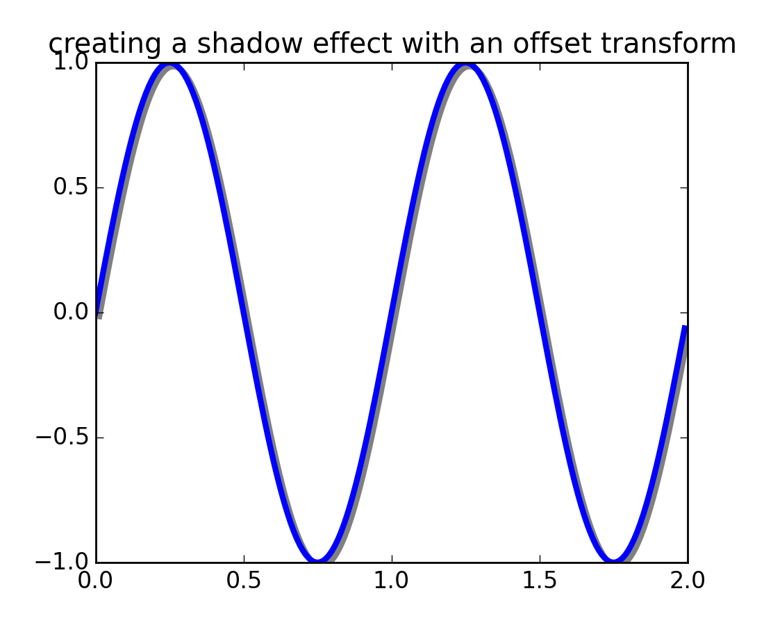
One use of transformations is to create a new transformation that is offset from another transformation, e.g., to place one object shifted a bit relative to another object. Typically you want the shift to be in some physical dimension, like points or inches rather than in data coordinates, so that the shift effect is constant at different zoom levels and dpi settings.
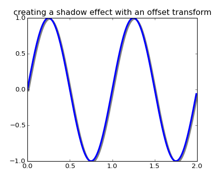
One use for an offset is to create a shadow effect, where you draw one object identical to the first just to the right of it, and just below it, adjusting the zorder to make sure the shadow is drawn first and then the object it is shadowing above it. The transforms module has a helper transformation ScaledTranslation. It is instantiated with:
trans = ScaledTranslation(xt, yt, scale_trans)
where xt and yt are the translation offsets, and scale_trans is a transformation which scales xt and yt at transformation time before applying the offsets. A typical use case is to use the figure fig.dpi_scale_trans transformation for the scale_trans argument, to first scale xt and yt specified in points to display space before doing the final offset. The dpi and inches offset is a common-enough use case that we have a special helper function to create it in matplotlib.transforms.offset_copy(), which returns a new transform with an added offset. But in the example below, we’ll create the offset transform ourselves. Note the use of the plus operator in:
offset = transforms.ScaledTranslation(dx, dy,
  fig.dpi_scale_trans)
shadow_transform = ax.transData + offset
showing that can chain transformations using the addition operator. This code says: first apply the data transformation ax.transData and then translate the data by dx and dy points. In typography, a`point <http://en.wikipedia.org/wiki/Point_%28typography%29>`_ is 1/72 inches, and by specifying your offsets in points, your figure will look the same regardless of the dpi resolution it is saved in.
import numpy as np
import matplotlib.pyplot as plt
import matplotlib.patches as patches
import matplotlib.transforms as transforms

fig = plt.figure()
ax = fig.add_subplot(111)

# make a simple sine wave
x = np.arange(0., 2., 0.01)
y = np.sin(2*np.pi*x)
line, = ax.plot(x, y, lw=3, color='blue')

# shift the object over 2 points, and down 2 points
dx, dy = 2/72., -2/72.
offset = transforms.ScaledTranslation(dx, dy,
  fig.dpi_scale_trans)
shadow_transform = ax.transData + offset

# now plot the same data with our offset transform;
# use the zorder to make sure we are below the line
ax.plot(x, y, lw=3, color='gray',
  transform=shadow_transform,
  zorder=0.5*line.get_zorder())

ax.set_title('creating a shadow effect with an offset transform')
plt.show()
(Source code, png, hires.png, pdf)
The ax.transData transform we have been working with in this tutorial is a composite of three different transformations that comprise the transformation pipeline from data -> display coordinates. Michael Droettboom implemented the transformations framework, taking care to provide a clean API that segregated the nonlinear projections and scales that happen in polar and logarithmic plots, from the linear affine transformations that happen when you pan and zoom. There is an efficiency here, because you can pan and zoom in your axes which affects the affine transformation, but you may not need to compute the potentially expensive nonlinear scales or projections on simple navigation events. It is also possible to multiply affine transformation matrices together, and then apply them to coordinates in one step. This is not true of all possible transformations.
Here is how the ax.transData instance is defined in the basic separable axis Axes class:
self.transData = self.transScale + (self.transLimits + self.transAxes)
We’ve been introduced to the transAxes instance above in Axes coordinates, which maps the (0,0), (1,1) corners of the axes or subplot bounding box to display space, so let’s look at these other two pieces.
self.transLimits is the transformation that takes you from data to axes coordinates; i.e., it maps your view xlim and ylim to the unit space of the axes (and transAxes then takes that unit space to display space). We can see this in action here
In [80]: ax = subplot(111)

In [81]: ax.set_xlim(0, 10)
Out[81]: (0, 10)

In [82]: ax.set_ylim(-1,1)
Out[82]: (-1, 1)

In [84]: ax.transLimits.transform((0,-1))
Out[84]: array([ 0.,  0.])

In [85]: ax.transLimits.transform((10,-1))
Out[85]: array([ 1.,  0.])

In [86]: ax.transLimits.transform((10,1))
Out[86]: array([ 1.,  1.])

In [87]: ax.transLimits.transform((5,0))
Out[87]: array([ 0.5,  0.5])
and we can use this same inverted transformation to go from the unit axes coordinates back to data coordinates.
In [90]: inv.transform((0.25, 0.25))
Out[90]: array([ 2.5, -0.5])
The final piece is the self.transScale attribute, which is responsible for the optional non-linear scaling of the data, e.g., for logarithmic axes. When an Axes is initially setup, this is just set to the identity transform, since the basic matplotlib axes has linear scale, but when you call a logarithmic scaling function like semilogx() or explicitly set the scale to logarithmic with set_xscale(), then the ax.transScale attribute is set to handle the nonlinear projection. The scales transforms are properties of the respective xaxis and yaxis Axis instances. For example, when you call ax.set_xscale('log'), the xaxis updates its scale to a matplotlib.scale.LogScale instance.
For non-separable axes the PolarAxes, there is one more piece to consider, the projection transformation. The transData matplotlib.projections.polar.PolarAxes is similar to that for the typical separable matplotlib Axes, with one additional piece transProjection:
self.transData = self.transScale + self.transProjection + \
    (self.transProjectionAffine + self.transAxes)
transProjection handles the projection from the space, e.g., latitude and longitude for map data, or radius and theta for polar data, to a separable Cartesian coordinate system. There are several projection examples in the matplotlib.projections package, and the best way to learn more is to open the source for those packages and see how to make your own, since matplotlib supports extensible axes and projections. Michael Droettboom has provided a nice tutorial example of creating a hammer projection axes; see api example code: custom_projection_example.py.