
(Source code, png, hires.png, pdf)

"""
Thanks Josh Hemann for the example
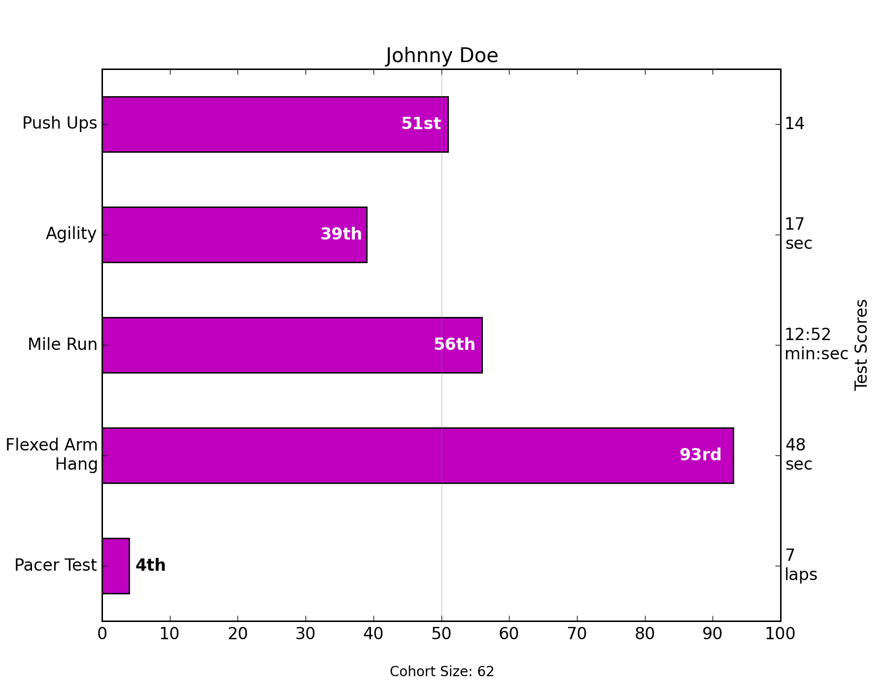
This examples comes from an application in which grade school gym
teachers wanted to be able to show parents how their child did across
a handful of fitness tests, and importantly, relative to how other
children did. To extract the plotting code for demo purposes, we'll
just make up some data for little Johnny Doe...
"""
import numpy as np
import matplotlib.pyplot as plt
import pylab
from matplotlib.ticker import MaxNLocator
student = 'Johnny Doe'
grade = 2
gender = 'boy'
cohortSize = 62 # The number of other 2nd grade boys
numTests = 5
testNames = ['Pacer Test', 'Flexed Arm\n Hang', 'Mile Run', 'Agility',
'Push Ups']
testMeta = ['laps', 'sec', 'min:sec', 'sec', '']
scores = ['7', '48', '12:52', '17', '14']
rankings = np.round(np.random.uniform(0, 1, numTests)*100, 0)
fig, ax1 = plt.subplots(figsize=(9, 7))
plt.subplots_adjust(left=0.115, right=0.88)
fig.canvas.set_window_title('Eldorado K-8 Fitness Chart')
pos = np.arange(numTests)+0.5 # Center bars on the Y-axis ticks
rects = ax1.barh(pos, rankings, align='center', height=0.5, color='m')
ax1.axis([0, 100, 0, 5])
pylab.yticks(pos, testNames)
ax1.set_title('Johnny Doe')
plt.text(50, -0.5, 'Cohort Size: ' + str(cohortSize),
horizontalalignment='center', size='small')
# Set the right-hand Y-axis ticks and labels and set X-axis tick marks at the
# deciles
ax2 = ax1.twinx()
ax2.plot([100, 100], [0, 5], 'white', alpha=0.1)
ax2.xaxis.set_major_locator(MaxNLocator(11))
xticks = pylab.setp(ax2, xticklabels=['0', '10', '20', '30', '40', '50', '60',
'70', '80', '90', '100'])
ax2.xaxis.grid(True, linestyle='--', which='major', color='grey',
alpha=0.25)
#Plot a solid vertical gridline to highlight the median position
plt.plot([50, 50], [0, 5], 'grey', alpha=0.25)
# Build up the score labels for the right Y-axis by first appending a carriage
# return to each string and then tacking on the appropriate meta information
# (i.e., 'laps' vs 'seconds'). We want the labels centered on the ticks, so if
# there is no meta info (like for pushups) then don't add the carriage return to
# the string
def withnew(i, scr):
if testMeta[i] != '':
return '%s\n' % scr
else:
return scr
scoreLabels = [withnew(i, scr) for i, scr in enumerate(scores)]
scoreLabels = [i+j for i, j in zip(scoreLabels, testMeta)]
# set the tick locations
ax2.set_yticks(pos)
# set the tick labels
ax2.set_yticklabels(scoreLabels)
# make sure that the limits are set equally on both yaxis so the ticks line up
ax2.set_ylim(ax1.get_ylim())
ax2.set_ylabel('Test Scores')
#Make list of numerical suffixes corresponding to position in a list
# 0 1 2 3 4 5 6 7 8 9
suffixes = ['th', 'st', 'nd', 'rd', 'th', 'th', 'th', 'th', 'th', 'th']
ax2.set_xlabel('Percentile Ranking Across ' + str(grade) + suffixes[grade]
+ ' Grade ' + gender.title() + 's')
# Lastly, write in the ranking inside each bar to aid in interpretation
for rect in rects:
# Rectangle widths are already integer-valued but are floating
# type, so it helps to remove the trailing decimal point and 0 by
# converting width to int type
width = int(rect.get_width())
# Figure out what the last digit (width modulo 10) so we can add
# the appropriate numerical suffix (e.g., 1st, 2nd, 3rd, etc)
lastDigit = width % 10
# Note that 11, 12, and 13 are special cases
if (width == 11) or (width == 12) or (width == 13):
suffix = 'th'
else:
suffix = suffixes[lastDigit]
rankStr = str(width) + suffix
if (width < 5): # The bars aren't wide enough to print the ranking inside
xloc = width + 1 # Shift the text to the right side of the right edge
clr = 'black' # Black against white background
align = 'left'
else:
xloc = 0.98*width # Shift the text to the left side of the right edge
clr = 'white' # White on magenta
align = 'right'
# Center the text vertically in the bar
yloc = rect.get_y()+rect.get_height()/2.0
ax1.text(xloc, yloc, rankStr, horizontalalignment=align,
verticalalignment='center', color=clr, weight='bold')
plt.show()
Keywords: python, matplotlib, pylab, example, codex (see Search examples)