
At the very least, you’ll need to have access to the
imshow() function. There are a couple of
ways to do it. The easy way for an interactive environment:
$ipython
to enter the ipython shell, followed by:
In [1]: %pylab
to enter the pylab environment.
The imshow function is now directly accessible (it’s in your namespace). See also Pyplot tutorial.
The more expressive, easier to understand later method (use this in your scripts to make it easier for others (including your future self) to read) is to use the matplotlib API (see Artist tutorial) where you use explicit namespaces and control object creation, etc...
In [1]: import matplotlib.pyplot as plt
In [2]: import matplotlib.image as mpimg
In [3]: import numpy as np
Examples below will use the latter method, for clarity. In these examples, if you use the %pylab method, you can skip the “mpimg.” and “plt.” prefixes.
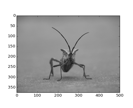
Plotting image data is supported by the Pillow). Natively, matplotlib only supports PNG images. The commands shown below fall back on Pillow if the native read fails.
The image used in this example is a PNG file, but keep that Pillow requirement in mind for your own data.
Here’s the image we’re going to play with:
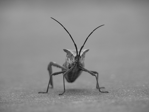
It’s a 24-bit RGB PNG image (8 bits for each of R, G, B). Depending on where you get your data, the other kinds of image that you’ll most likely encounter are RGBA images, which allow for transparency, or single-channel grayscale (luminosity) images. You can right click on it and choose “Save image as” to download it to your computer for the rest of this tutorial.
And here we go...
In [4]: img=mpimg.imread('stinkbug.png')
Out[4]:
array([[[ 0.40784314,  0.40784314,  0.40784314],
        [ 0.40784314,  0.40784314,  0.40784314],
        [ 0.40784314,  0.40784314,  0.40784314],
        ...,
        [ 0.42745098,  0.42745098,  0.42745098],
        [ 0.42745098,  0.42745098,  0.42745098],
        [ 0.42745098,  0.42745098,  0.42745098]],

       [[ 0.41176471,  0.41176471,  0.41176471],
        [ 0.41176471,  0.41176471,  0.41176471],
        [ 0.41176471,  0.41176471,  0.41176471],
        ...,
        [ 0.42745098,  0.42745098,  0.42745098],
        [ 0.42745098,  0.42745098,  0.42745098],
        [ 0.42745098,  0.42745098,  0.42745098]],

       [[ 0.41960785,  0.41960785,  0.41960785],
        [ 0.41568628,  0.41568628,  0.41568628],
        [ 0.41568628,  0.41568628,  0.41568628],
        ...,
        [ 0.43137255,  0.43137255,  0.43137255],
        [ 0.43137255,  0.43137255,  0.43137255],
        [ 0.43137255,  0.43137255,  0.43137255]],

       ...,
       [[ 0.43921569,  0.43921569,  0.43921569],
        [ 0.43529412,  0.43529412,  0.43529412],
        [ 0.43137255,  0.43137255,  0.43137255],
        ...,
        [ 0.45490196,  0.45490196,  0.45490196],
        [ 0.4509804 ,  0.4509804 ,  0.4509804 ],
        [ 0.4509804 ,  0.4509804 ,  0.4509804 ]],

       [[ 0.44313726,  0.44313726,  0.44313726],
        [ 0.44313726,  0.44313726,  0.44313726],
        [ 0.43921569,  0.43921569,  0.43921569],
        ...,
        [ 0.4509804 ,  0.4509804 ,  0.4509804 ],
        [ 0.44705883,  0.44705883,  0.44705883],
        [ 0.44705883,  0.44705883,  0.44705883]],

       [[ 0.44313726,  0.44313726,  0.44313726],
        [ 0.4509804 ,  0.4509804 ,  0.4509804 ],
        [ 0.4509804 ,  0.4509804 ,  0.4509804 ],
        ...,
        [ 0.44705883,  0.44705883,  0.44705883],
        [ 0.44705883,  0.44705883,  0.44705883],
        [ 0.44313726,  0.44313726,  0.44313726]]], dtype=float32)
Note the dtype there - float32. Matplotlib has rescaled the 8 bit data from each channel to floating point data between 0.0 and 1.0. As a side note, the only datatype that Pillow can work with is uint8. Matplotlib plotting can handle float32 and uint8, but image reading/writing for any format other than PNG is limited to uint8 data. Why 8 bits? Most displays can only render 8 bits per channel worth of color gradation. Why can they only render 8 bits/channel? Because that’s about all the human eye can see. More here (from a photography standpoint): Luminous Landscape bit depth tutorial.
Each inner list represents a pixel. Here, with an RGB image, there are 3 values. Since it’s a black and white image, R, G, and B are all similar. An RGBA (where A is alpha, or transparency), has 4 values per inner list, and a simple luminance image just has one value (and is thus only a 2-D array, not a 3-D array). For RGB and RGBA images, matplotlib supports float32 and uint8 data types. For grayscale, matplotlib supports only float32. If your array data does not meet one of these descriptions, you need to rescale it.
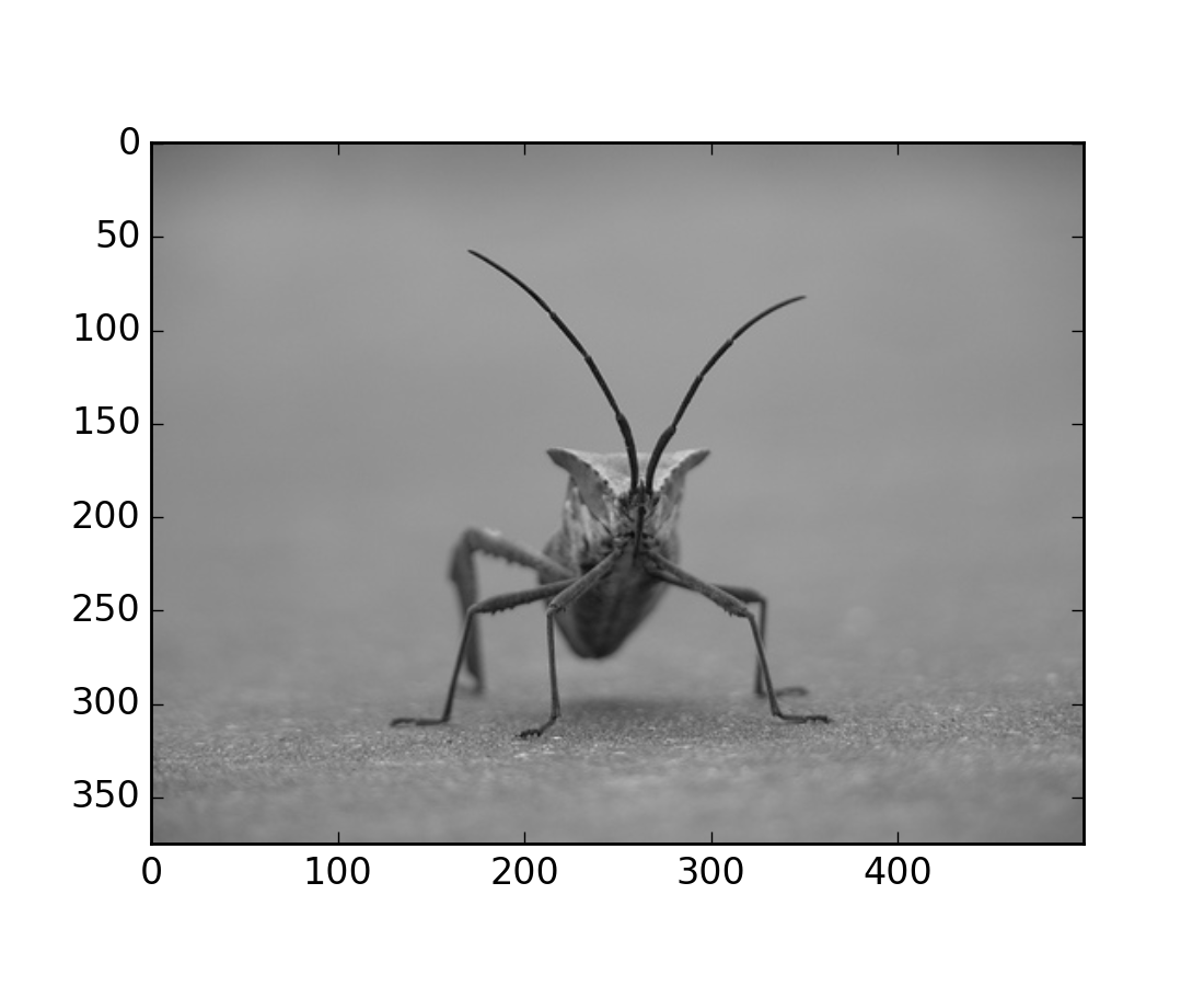
So, you have your data in a numpy array (either by importing it, or by
generating it). Let’s render it. In Matplotlib, this is performed
using the imshow() function. Here we’ll grab
the plot object. This object gives you an easy way to manipulate the
plot from the prompt.
In [5]: imgplot = plt.imshow(img)
(Source code, png, hires.png, pdf)

You can also plot any numpy array - just remember that the datatype must be float32 (and range from 0.0 to 1.0) or uint8.
Pseudocolor can be a useful tool for enhancing contrast and visualizing your data more easily. This is especially useful when making presentations of your data using projectors - their contrast is typically quite poor.
Pseudocolor is only relevant to single-channel, grayscale, luminosity images. We currently have an RGB image. Since R, G, and B are all similar (see for yourself above or in your data), we can just pick one channel of our data:
In [6]: lum_img = img[:,:,0]
This is array slicing. You can read more in the Numpy tutorial.
In [7]: imgplot = plt.imshow(lum_img)
(Source code, png, hires.png, pdf)
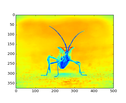
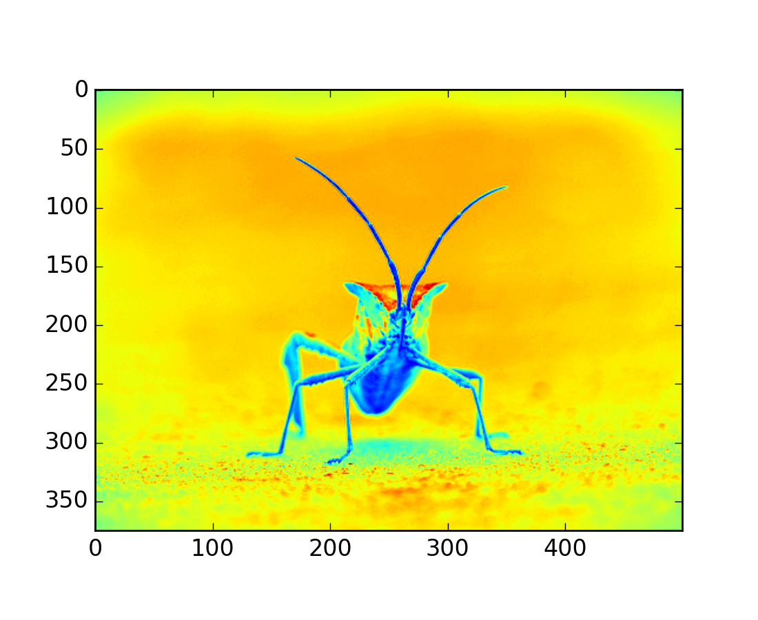
Now, with a luminosity image, the default colormap (aka lookup table,
LUT), is applied. The default is called jet. There are plenty of
others to choose from. Let’s set some others using the
set_cmap() method on our image plot
object:
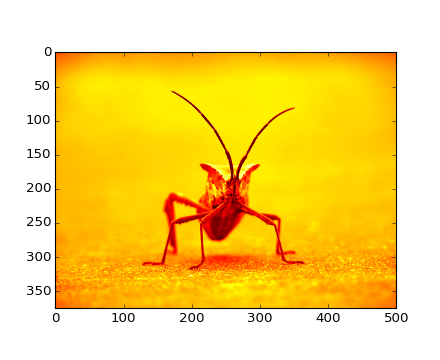
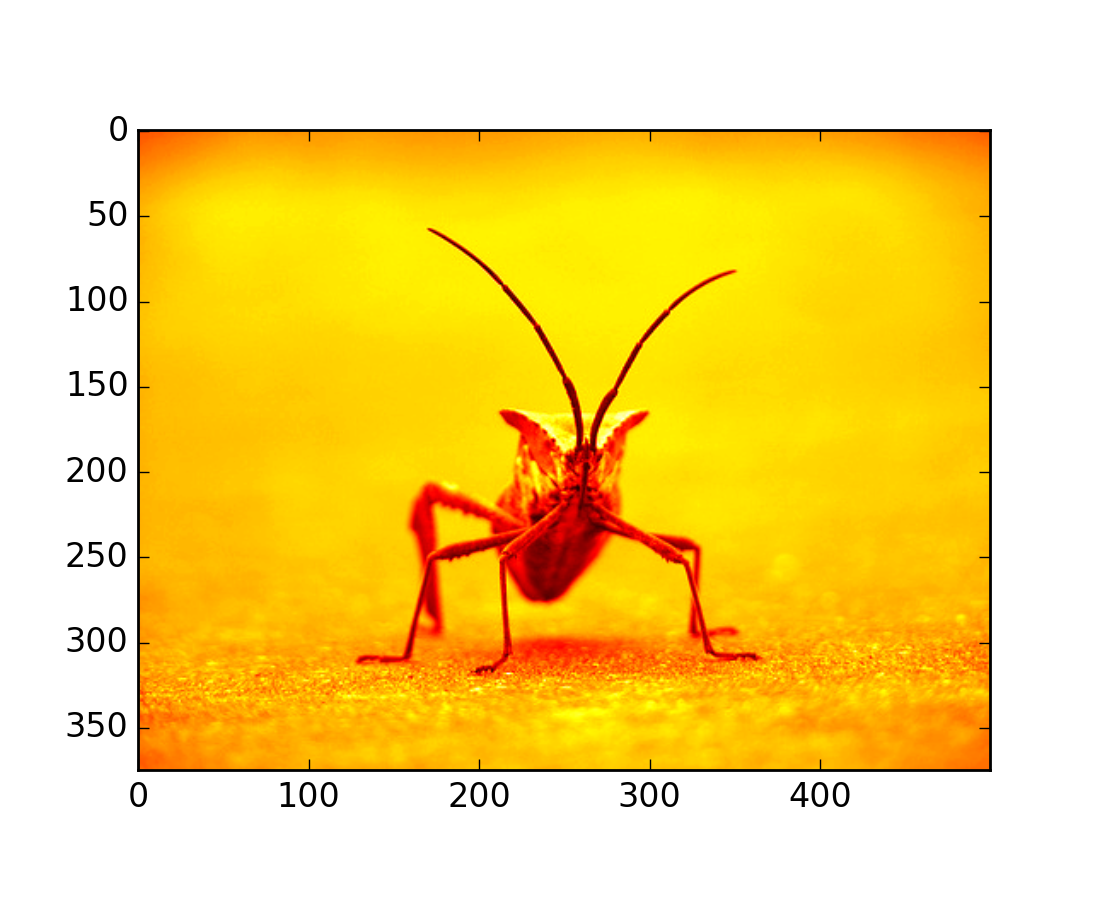
In [8]: imgplot.set_cmap('hot')
(Source code, png, hires.png, pdf)
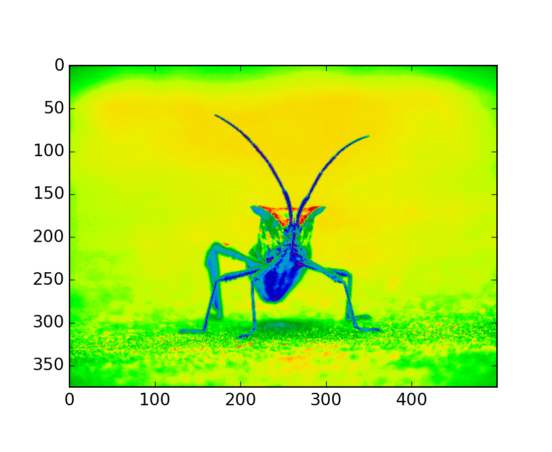
In [9]: imgplot.set_cmap('spectral')
(Source code, png, hires.png, pdf)
There are many other colormap schemes available. See the list and images of the colormaps.
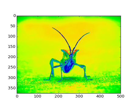
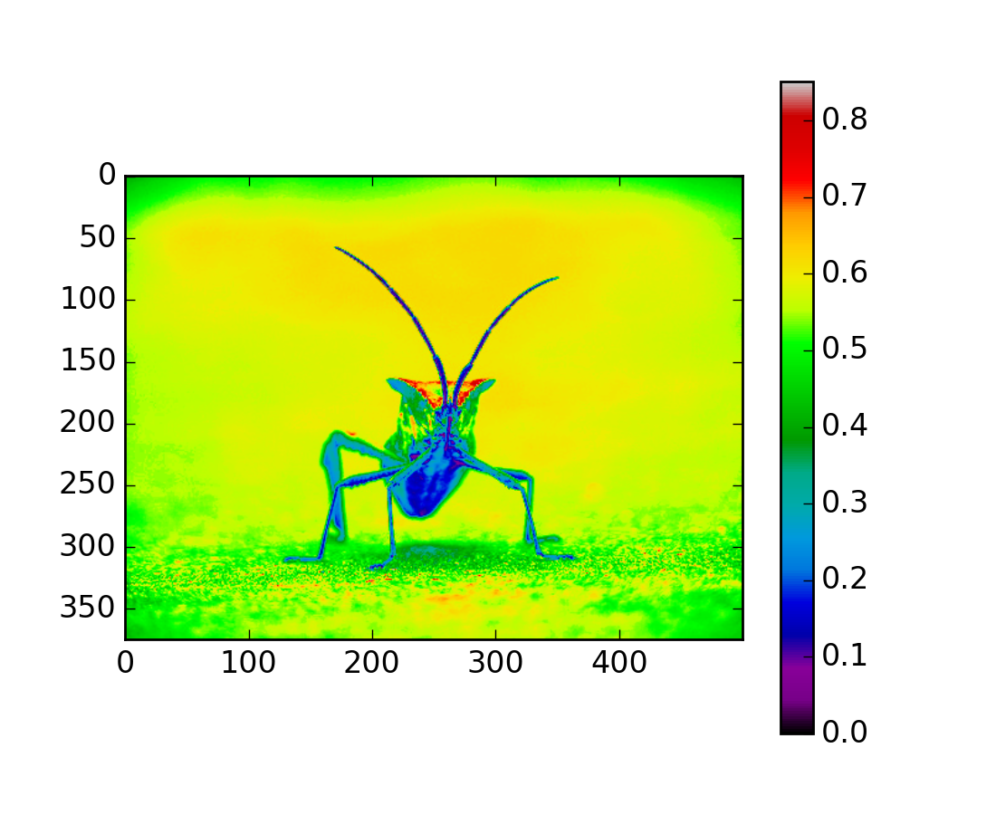
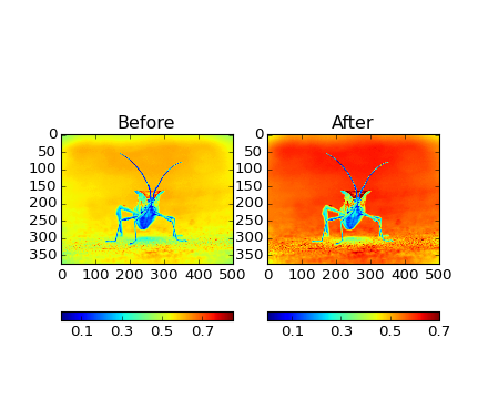
It’s helpful to have an idea of what value a color represents. We can do that by adding color bars. It’s as easy as one line:
In [10]: plt.colorbar()
(Source code, png, hires.png, pdf)
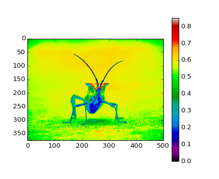
This adds a colorbar to your existing figure. This won’t automatically change if you change you switch to a different colormap - you have to re-create your plot, and add in the colorbar again.
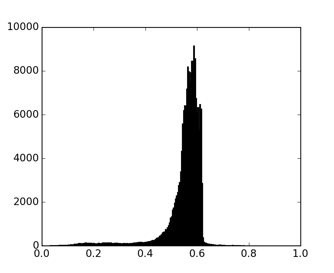
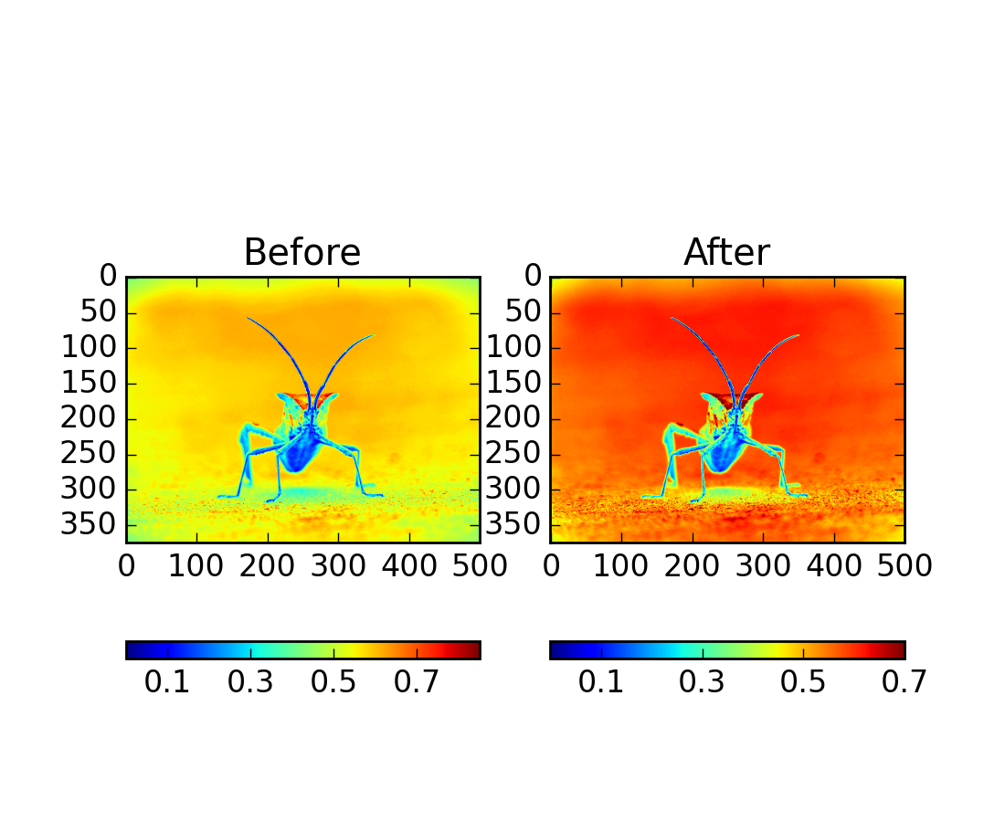
Sometimes you want to enhance the contrast in your image, or expand
the contrast in a particular region while sacrificing the detail in
colors that don’t vary much, or don’t matter. A good tool to find
interesting regions is the histogram. To create a histogram of our
image data, we use the hist() function.
In[10]: plt.hist(lum_img.flatten(), 256, range=(0.0,1.0), fc='k', ec='k')
(Source code, png, hires.png, pdf)

Most often, the “interesting” part of the image is around the peak,
and you can get extra contrast by clipping the regions above and/or
below the peak. In our histogram, it looks like there’s not much
useful information in the high end (not many white things in the
image). Let’s adjust the upper limit, so that we effectively “zoom in
on” part of the histogram. We do this by calling the
set_clim() method of the image plot
object.
In[11]: imgplot.set_clim(0.0,0.7)
(Source code, png, hires.png, pdf)

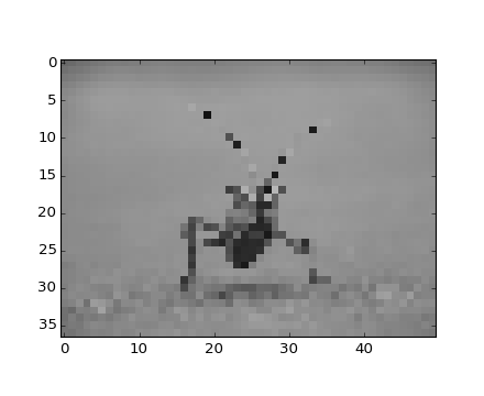
Interpolation calculates what the color or value of a pixel “should” be, according to different mathematical schemes. One common place that this happens is when you resize an image. The number of pixels change, but you want the same information. Since pixels are discrete, there’s missing space. Interpolation is how you fill that space. This is why your images sometimes come out looking pixelated when you blow them up. The effect is more pronounced when the difference between the original image and the expanded image is greater. Let’s take our image and shrink it. We’re effectively discarding pixels, only keeping a select few. Now when we plot it, that data gets blown up to the size on your screen. The old pixels aren’t there anymore, and the computer has to draw in pixels to fill that space.
In [8]: from PIL import Image
In [9]: img = Image.open('stinkbug.png')    # Open image as Pillow image object
In [10]: rsize = img.resize((img.size[0]/10,img.size[1]/10)) # Use Pillow to resize
In [11]: rsizeArr = np.asarray(rsize)  # Get array back
In [12]: imgplot = plt.imshow(rsizeArr)
(Source code, png, hires.png, pdf)
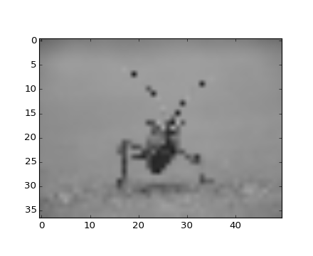
Here we have the default interpolation, bilinear, since we did not
give imshow() any interpolation argument.
Let’s try some others:
In [10]: imgplot.set_interpolation('nearest')
(Source code, png, hires.png, pdf)

In [10]: imgplot.set_interpolation('bicubic')
(Source code, png, hires.png, pdf)

Bicubic interpolation is often used when blowing up photos - people tend to prefer blurry over pixelated.