
The matplotlib AxesGrid toolkit is a collection of helper classes, mainly to ease displaying (multiple) images in matplotlib.
Note
AxesGrid toolkit has been a part of matplotlib since v 0.99. Originally, the toolkit had a single namespace of axes_grid. In more recent version (since svn r8226), the toolkit has divided into two separate namespace (axes_grid1 and axisartist). While axes_grid namespace is maintained for the backward compatibility, use of axes_grid1 and axisartist is recommended.
Warning
axes_grid and axisartist (but not axes_grid1) uses a custom Axes class (derived from the mpl’s original Axes class). As a side effect, some commands (mostly tick-related) do not work. Use axes_grid1 to avoid this, or see how things are different in axes_grid and axisartist (LINK needed)
AxesGrid toolkit has two namespaces (axes_grid1 and axisartist). axisartist contains custom Axes class that is meant to support for curvilinear grids (e.g., the world coordinate system in astronomy). Unlike mpl’s original Axes class which uses Axes.xaxis and Axes.yaxis to draw ticks, ticklines and etc., Axes in axisartist uses special artist (AxisArtist) which can handle tick, ticklines and etc. for curved coordinate systems.
(Source code, png, hires.png, pdf)

Since it uses a special artists, some mpl commands that work on Axes.xaxis and Axes.yaxis may not work. See LINK for more detail.
axes_grid1 is a collection of helper classes to ease displaying (multiple) images with matplotlib. In matplotlib, the axes location (and size) is specified in the normalized figure coordinates, which may not be ideal for displaying images that needs to have a given aspect ratio. For example, it helps you to have a colorbar whose height always matches that of the image. ImageGrid, RGB Axes and AxesDivider are helper classes that deals with adjusting the location of (multiple) Axes. They provides a framework to adjust the position of multiple axes at the drawing time. ParasiteAxes provides twinx(or twiny)-like features so that you can plot different data (e.g., different y-scale) in a same Axes. AnchoredArtists includes custom artists which are placed at some anchored position, like the legend.
(Source code, png, hires.png, pdf)

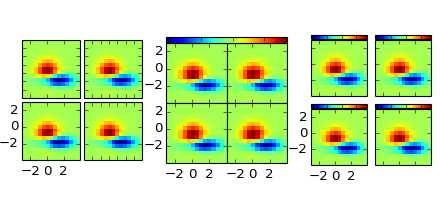
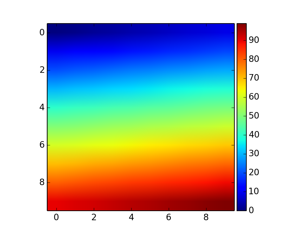
A class that creates a grid of Axes. In matplotlib, the axes location (and size) is specified in the normalized figure coordinates. This may not be ideal for images that needs to be displayed with a given aspect ratio. For example, displaying images of a same size with some fixed padding between them cannot be easily done in matplotlib. ImageGrid is used in such case.
import matplotlib.pyplot as plt
from mpl_toolkits.axes_grid1 import ImageGrid
import numpy as np

im = np.arange(100)
im.shape = 10, 10

fig = plt.figure(1, (4., 4.))
grid = ImageGrid(fig, 111, # similar to subplot(111)
                nrows_ncols = (2, 2), # creates 2x2 grid of axes
                axes_pad=0.1, # pad between axes in inch.
                )

for i in range(4):
    grid[i].imshow(im) # The AxesGrid object work as a list of axes.

plt.show()
(Source code, png, hires.png, pdf)
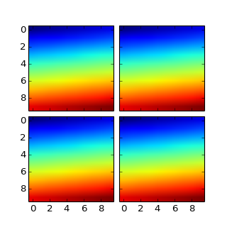
The position of each axes is determined at the drawing time (see AxesDivider), so that the size of the entire grid fits in the given rectangle (like the aspect of axes). Note that in this example, the paddings between axes are fixed even if you changes the figure size.
axes in the same column has a same axes width (in figure coordinate), and similarly, axes in the same row has a same height. The widths (height) of the axes in the same row (column) are scaled according to their view limits (xlim or ylim).
import matplotlib.pyplot as plt
from mpl_toolkits.axes_grid1 import ImageGrid

def get_demo_image():
    import numpy as np
    from matplotlib.cbook import get_sample_data
    f = get_sample_data("axes_grid/bivariate_normal.npy", asfileobj=False)
    z = np.load(f)
    # z is a numpy array of 15x15
    return z, (-3,4,-4,3)

F = plt.figure(1, (5.5, 3.5))
grid = ImageGrid(F, 111, # similar to subplot(111)
                nrows_ncols = (1, 3),
                axes_pad = 0.1,
                add_all=True,
                label_mode = "L",
                )

Z, extent = get_demo_image() # demo image

im1=Z
im2=Z[:,:10]
im3=Z[:,10:]
vmin, vmax = Z.min(), Z.max()
for i, im in enumerate([im1, im2, im3]):
    ax = grid[i]
    ax.imshow(im, origin="lower", vmin=vmin, vmax=vmax, interpolation="nearest")

plt.draw()
plt.show()
(Source code, png, hires.png, pdf)
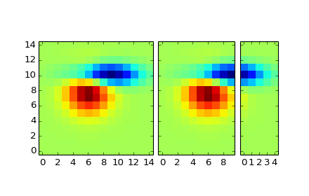
xaxis are shared among axes in a same column. Similarly, yaxis are shared among axes in a same row. Therefore, changing axis properties (view limits, tick location, etc. either by plot commands or using your mouse in interactive backends) of one axes will affect all other shared axes.
When initialized, ImageGrid creates given number (ngrids or ncols * nrows if ngrids is None) of Axes instances. A sequence-like interface is provided to access the individual Axes instances (e.g., grid[0] is the first Axes in the grid. See below for the order of axes).
AxesGrid takes following arguments,
Name Default Description fig rect nrows_ncols number of rows and cols. e.g., (2,2) ngrids None number of grids. nrows x ncols if None direction “row” increasing direction of axes number. [row|column] axes_pad 0.02 pad between axes in inches add_all True Add axes to figures if True share_all False xaxis & yaxis of all axes are shared if True aspect True aspect of axes label_mode “L” location of tick labels thaw will be displayed. “1” (only the lower left axes), “L” (left most and bottom most axes), or “all”. cbar_mode None [None|single|each] cbar_location “right” [right|top] cbar_pad None pad between image axes and colorbar axes cbar_size “5%” size of the colorbar axes_class None
- rect
- specifies the location of the grid. You can either specify coordinates of the rectangle to be used (e.g., (0.1, 0.1, 0.8, 0.8) as in the Axes), or the subplot-like position (e.g., “121”).
- direction
- means the increasing direction of the axes number.
- aspect
- By default (False), widths and heights of axes in the grid are scaled independently. If True, they are scaled according to their data limits (similar to aspect parameter in mpl).
- share_all
- if True, xaxis and yaxis of all axes are shared.
- direction
direction of increasing axes number. For “row”,
grid[0] grid[1] grid[2] grid[3] For “column”,
grid[0] grid[2] grid[1] grid[3]
You can also create a colorbar (or colorbars). You can have colorbar for each axes (cbar_mode=”each”), or you can have a single colorbar for the grid (cbar_mode=”single”). The colorbar can be placed on your right, or top. The axes for each colorbar is stored as a cbar_axes attribute.
The examples below show what you can do with AxesGrid.
(Source code, png, hires.png, pdf)
Behind the scene, the ImageGrid class and the RGBAxes class utilize the AxesDivider class, whose role is to calculate the location of the axes at drawing time. While a more about the AxesDivider is (will be) explained in (yet to be written) AxesDividerGuide, direct use of the AxesDivider class will not be necessary for most users. The axes_divider module provides a helper function make_axes_locatable, which can be useful. It takes a existing axes instance and create a divider for it.
ax = subplot(1,1,1)
divider = make_axes_locatable(ax)
make_axes_locatable returns an instance of the AxesLocator class, derived from the Locator. It provides append_axes method that creates a new axes on the given side of (“top”, “right”, “bottom” and “left”) of the original axes.
import matplotlib.pyplot as plt
from mpl_toolkits.axes_grid1 import make_axes_locatable
import numpy as np

ax = plt.subplot(111)
im = ax.imshow(np.arange(100).reshape((10,10)))

# create an axes on the right side of ax. The width of cax will be 5%
# of ax and the padding between cax and ax will be fixed at 0.05 inch.
divider = make_axes_locatable(ax)
cax = divider.append_axes("right", size="5%", pad=0.05)

plt.colorbar(im, cax=cax)
(Source code, png, hires.png, pdf)

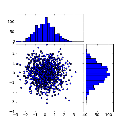
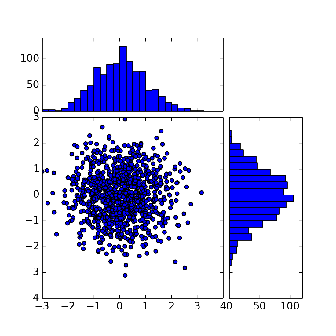
The “scatter_hist.py” example in mpl can be rewritten using make_axes_locatable.
axScatter = subplot(111)
axScatter.scatter(x, y)
axScatter.set_aspect(1.)

# create new axes on the right and on the top of the current axes.
divider = make_axes_locatable(axScatter)
axHistx = divider.append_axes("top", size=1.2, pad=0.1, sharex=axScatter)
axHisty = divider.append_axes("right", size=1.2, pad=0.1, sharey=axScatter)

# the scatter plot:
# histograms
bins = np.arange(-lim, lim + binwidth, binwidth)
axHistx.hist(x, bins=bins)
axHisty.hist(y, bins=bins, orientation='horizontal')
See the full source code below.
(Source code, png, hires.png, pdf)

The scatter_hist using the AxesDivider has some advantage over the original scatter_hist.py in mpl. For example, you can set the aspect ratio of the scatter plot, even with the x-axis or y-axis is shared accordingly.
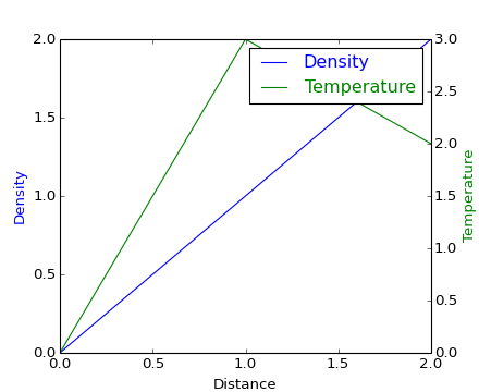
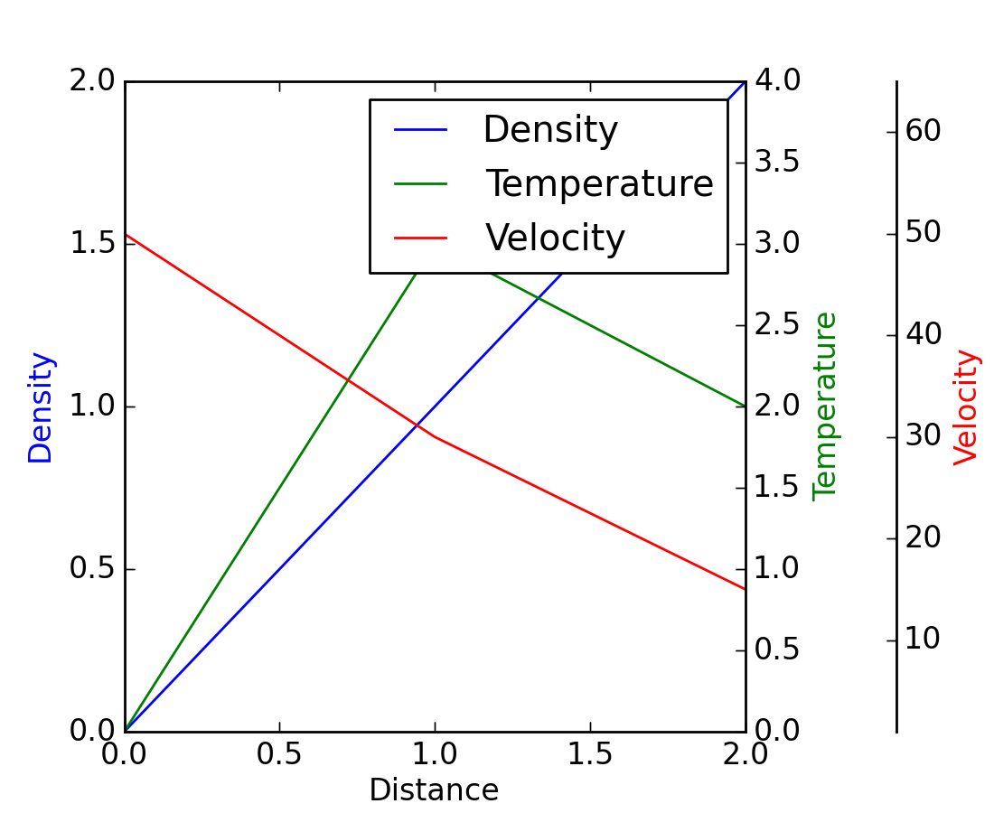
The ParasiteAxes is an axes whose location is identical to its host axes. The location is adjusted in the drawing time, thus it works even if the host change its location (e.g., images).
In most cases, you first create a host axes, which provides a few method that can be used to create parasite axes. They are twinx, twiny (which are similar to twinx and twiny in the matplotlib) and twin. twin takes an arbitrary transformation that maps between the data coordinates of the host axes and the parasite axes. draw method of the parasite axes are never called. Instead, host axes collects artists in parasite axes and draw them as if they belong to the host axes, i.e., artists in parasite axes are merged to those of the host axes and then drawn according to their zorder. The host and parasite axes modifies some of the axes behavior. For example, color cycle for plot lines are shared between host and parasites. Also, the legend command in host, creates a legend that includes lines in the parasite axes. To create a host axes, you may use host_suplot or host_axes command.
from mpl_toolkits.axes_grid1 import host_subplot
import matplotlib.pyplot as plt

host = host_subplot(111)

par = host.twinx()

host.set_xlabel("Distance")
host.set_ylabel("Density")
par.set_ylabel("Temperature")

p1, = host.plot([0, 1, 2], [0, 1, 2], label="Density")
p2, = par.plot([0, 1, 2], [0, 3, 2], label="Temperature")

leg = plt.legend()

host.yaxis.get_label().set_color(p1.get_color())
leg.texts[0].set_color(p1.get_color())

par.yaxis.get_label().set_color(p2.get_color())
leg.texts[1].set_color(p2.get_color())

plt.show()
(Source code, png, hires.png, pdf)
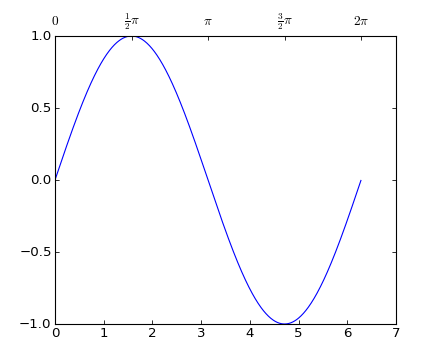
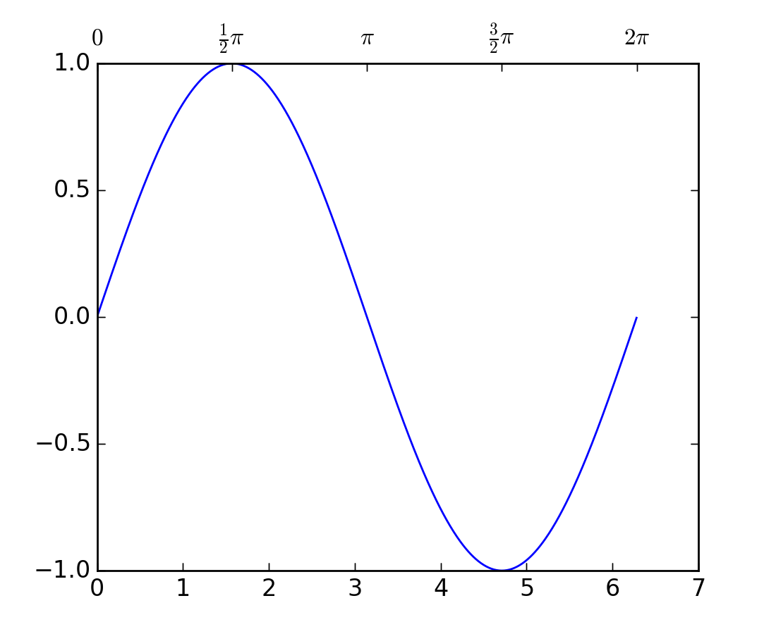
twin without a transform argument treat the parasite axes to have a same data transform as the host. This can be useful when you want the top(or right)-axis to have different tick-locations, tick-labels, or tick-formatter for bottom(or left)-axis.
ax2 = ax.twin() # now, ax2 is responsible for "top" axis and "right" axis
ax2.set_xticks([0., .5*np.pi, np.pi, 1.5*np.pi, 2*np.pi])
ax2.set_xticklabels(["0", r"$\frac{1}{2}\pi$",
                     r"$\pi$", r"$\frac{3}{2}\pi$", r"$2\pi$"])
(Source code, png, hires.png, pdf)
A more sophisticated example using twin. Note that if you change the x-limit in the host axes, the x-limit of the parasite axes will change accordingly.
(Source code, png, hires.png, pdf)
It’s a collection of artists whose location is anchored to the (axes) bbox, like the legend. It is derived from OffsetBox in mpl, and artist need to be drawn in the canvas coordinate. But, there is a limited support for an arbitrary transform. For example, the ellipse in the example below will have width and height in the data coordinate.
import matplotlib.pyplot as plt
def draw_text(ax):
from mpl_toolkits.axes_grid1.anchored_artists import AnchoredText
at = AnchoredText("Figure 1a",
loc=2, prop=dict(size=8), frameon=True,
)
at.patch.set_boxstyle("round,pad=0.,rounding_size=0.2")
ax.add_artist(at)
at2 = AnchoredText("Figure 1(b)",
loc=3, prop=dict(size=8), frameon=True,
bbox_to_anchor=(0., 1.),
bbox_transform=ax.transAxes
)
at2.patch.set_boxstyle("round,pad=0.,rounding_size=0.2")
ax.add_artist(at2)
def draw_circle(ax): # circle in the canvas coordinate
from mpl_toolkits.axes_grid1.anchored_artists import AnchoredDrawingArea
from matplotlib.patches import Circle
ada = AnchoredDrawingArea(20, 20, 0, 0,
loc=1, pad=0., frameon=False)
p = Circle((10, 10), 10)
ada.da.add_artist(p)
ax.add_artist(ada)
def draw_ellipse(ax):
from mpl_toolkits.axes_grid1.anchored_artists import AnchoredEllipse
# draw an ellipse of width=0.1, height=0.15 in the data coordinate
ae = AnchoredEllipse(ax.transData, width=0.1, height=0.15, angle=0.,
loc=3, pad=0.5, borderpad=0.4, frameon=True)
ax.add_artist(ae)
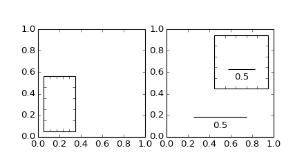
def draw_sizebar(ax):
from mpl_toolkits.axes_grid1.anchored_artists import AnchoredSizeBar
# draw a horizontal bar with length of 0.1 in Data coordinate
# (ax.transData) with a label underneath.
asb = AnchoredSizeBar(ax.transData,
0.1,
r"1$^{\prime}$",
loc=8,
pad=0.1, borderpad=0.5, sep=5,
frameon=False)
ax.add_artist(asb)
if 1:
ax = plt.gca()
ax.set_aspect(1.)
draw_text(ax)
draw_circle(ax)
draw_ellipse(ax)
draw_sizebar(ax)
plt.show()
(Source code, png, hires.png, pdf)
mpl_toolkits.axes_grid.inset_locator provides helper classes and functions to place your (inset) axes at the anchored position of the parent axes, similarly to AnchoredArtist.
Using mpl_toolkits.axes_grid.inset_locator.inset_axes(), you can have inset axes whose size is either fixed, or a fixed proportion of the parent axes. For example,:
inset_axes = inset_axes(parent_axes,
                        width="30%", # width = 30% of parent_bbox
                        height=1., # height : 1 inch
                        loc=3)
creates an inset axes whose width is 30% of the parent axes and whose height is fixed at 1 inch.
You may creates your inset whose size is determined so that the data scale of the inset axes to be that of the parent axes multiplied by some factor. For example,
inset_axes = zoomed_inset_axes(ax,
                               0.5, # zoom = 0.5
                               loc=1)
creates an inset axes whose data scale is half of the parent axes. Here is complete examples.
(Source code, png, hires.png, pdf)

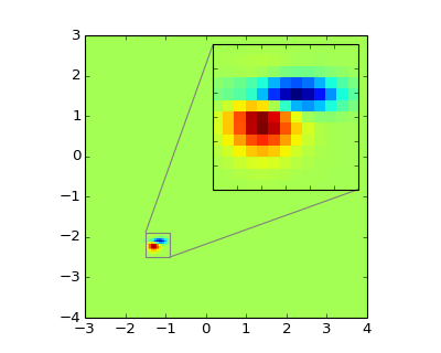
For example, zoomed_inset_axes() can be used when you want the inset represents the zoom-up of the small portion in the parent axes. And mpl_toolkits/axes_grid/inset_locator provides a helper function mark_inset() to mark the location of the area represented by the inset axes.
import matplotlib.pyplot as plt

from mpl_toolkits.axes_grid1.inset_locator import zoomed_inset_axes
from mpl_toolkits.axes_grid1.inset_locator import mark_inset

import numpy as np

def get_demo_image():
    from matplotlib.cbook import get_sample_data
    import numpy as np
    f = get_sample_data("axes_grid/bivariate_normal.npy", asfileobj=False)
    z = np.load(f)
    # z is a numpy array of 15x15
    return z, (-3,4,-4,3)

fig, ax = plt.subplots(figsize=[5,4])

# prepare the demo image
Z, extent = get_demo_image()
Z2 = np.zeros([150, 150], dtype="d")
ny, nx = Z.shape
Z2[30:30+ny, 30:30+nx] = Z

# extent = [-3, 4, -4, 3]
ax.imshow(Z2, extent=extent, interpolation="nearest",
          origin="lower")

axins = zoomed_inset_axes(ax, 6, loc=1) # zoom = 6
axins.imshow(Z2, extent=extent, interpolation="nearest",
             origin="lower")

# sub region of the original image
x1, x2, y1, y2 = -1.5, -0.9, -2.5, -1.9
axins.set_xlim(x1, x2)
axins.set_ylim(y1, y2)

plt.xticks(visible=False)
plt.yticks(visible=False)

# draw a bbox of the region of the inset axes in the parent axes and
# connecting lines between the bbox and the inset axes area
mark_inset(ax, axins, loc1=2, loc2=4, fc="none", ec="0.5")

plt.draw()
plt.show()
(Source code, png, hires.png, pdf)

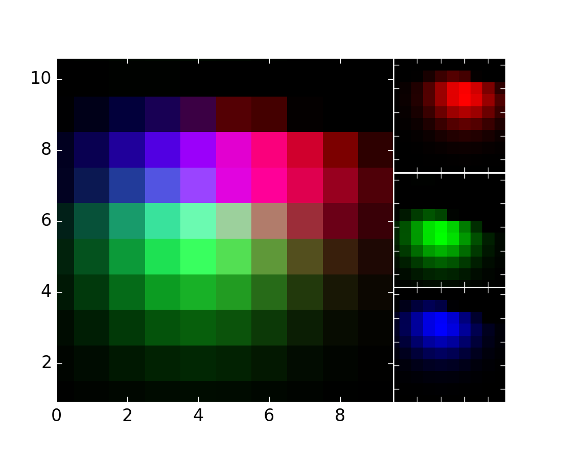
RGBAxes is a helper class to conveniently show RGB composite images. Like ImageGrid, the location of axes are adjusted so that the area occupied by them fits in a given rectangle. Also, the xaxis and yaxis of each axes are shared.
from mpl_toolkits.axes_grid1.axes_rgb import RGBAxes

fig = plt.figure(1)
ax = RGBAxes(fig, [0.1, 0.1, 0.8, 0.8])

r, g, b = get_rgb() # r,g,b are 2-d images
ax.imshow_rgb(r, g, b,
              origin="lower", interpolation="nearest")
(Source code, png, hires.png, pdf)
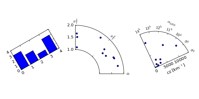
AxisArtist module provides a custom (and very experimental) Axes class, where each axis (left, right, top and bottom) have a separate artist associated which is responsible to draw axis-line, ticks, ticklabels, label. Also, you can create your own axis, which can pass through a fixed position in the axes coordinate, or a fixed position in the data coordinate (i.e., the axis floats around when viewlimit changes).
The axes class, by default, have its xaxis and yaxis invisible, and has 4 additional artists which are responsible to draw axis in “left”,”right”,”bottom” and “top”. They are accessed as ax.axis[“left”], ax.axis[“right”], and so on, i.e., ax.axis is a dictionary that contains artists (note that ax.axis is still a callable methods and it behaves as an original Axes.axis method in mpl).
To create an axes,
import mpl_toolkits.axisartist as AA
fig = plt.figure(1)
ax = AA.Axes(fig, [0.1, 0.1, 0.8, 0.8])
fig.add_axes(ax)
or to create a subplot
ax = AA.Subplot(fig, 111)
fig.add_subplot(ax)
For example, you can hide the right, and top axis by
ax.axis["right"].set_visible(False)
ax.axis["top"].set_visible(False)
(Source code, png, hires.png, pdf)

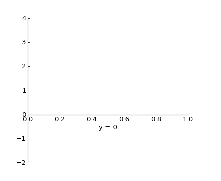
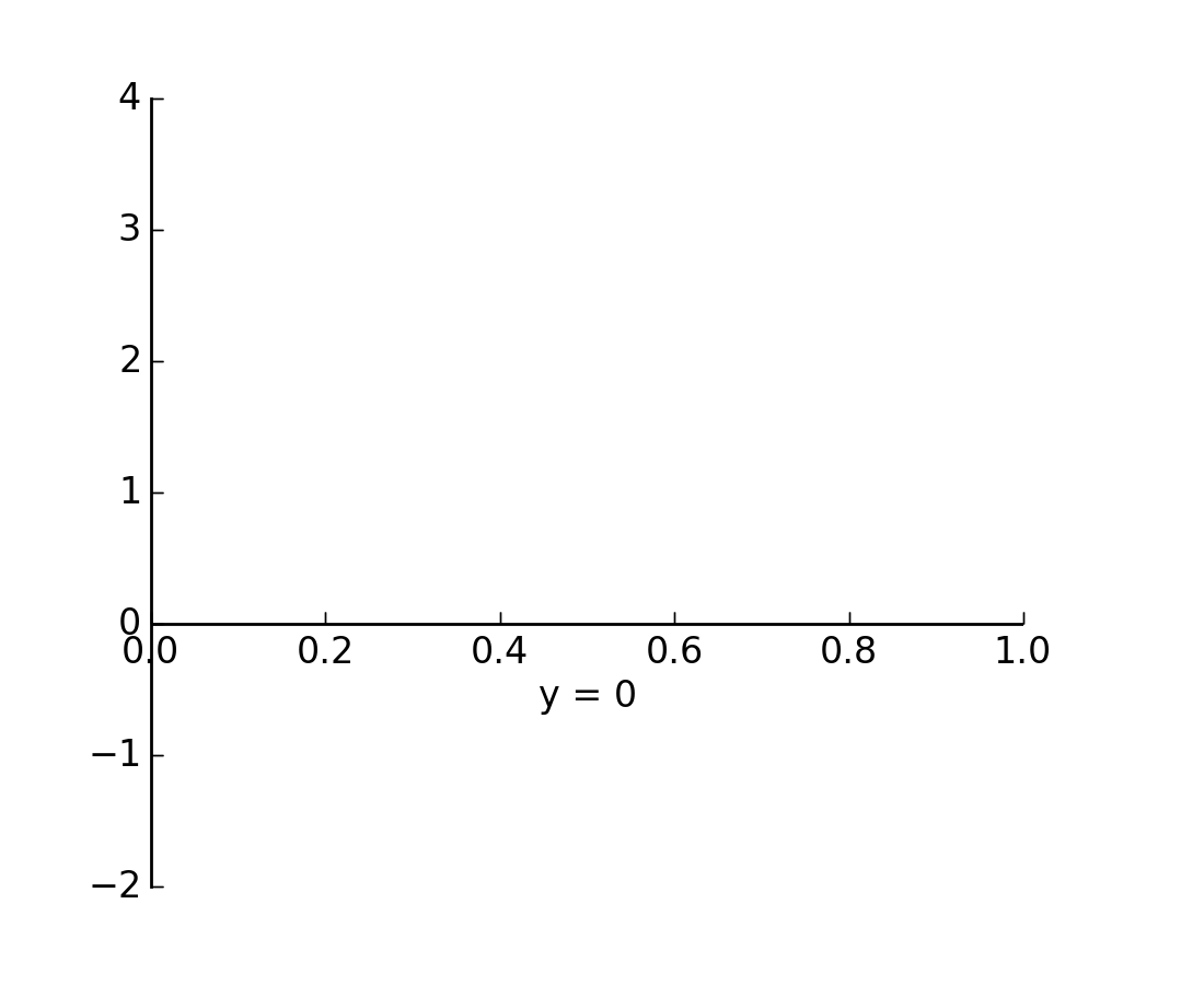
It is also possible to add an extra axis. For example, you may have an horizontal axis at y=0 (in data coordinate).
ax.axis["y=0"] = ax.new_floating_axis(nth_coord=0, value=0)
import matplotlib.pyplot as plt
import mpl_toolkits.axisartist as AA

fig = plt.figure(1)
fig.subplots_adjust(right=0.85)
ax = AA.Subplot(fig, 1, 1, 1)
fig.add_subplot(ax)

# make some axis invisible
ax.axis["bottom", "top", "right"].set_visible(False)

# make an new axis along the first axis axis (x-axis) which pass
# throught y=0.
ax.axis["y=0"] = ax.new_floating_axis(nth_coord=0, value=0,
                                      axis_direction="bottom")
ax.axis["y=0"].toggle(all=True)
ax.axis["y=0"].label.set_text("y = 0")

ax.set_ylim(-2, 4)

plt.show()
(Source code, png, hires.png, pdf)

Or a fixed axis with some offset
# make new (right-side) yaxis, but wth some offset
ax.axis["right2"] = ax.new_fixed_axis(loc="right",
                                      offset=(20, 0))
Most commands in the axes_grid1 toolkit can take a axes_class keyword argument, and the commands creates an axes of the given class. For example, to create a host subplot with axisartist.Axes,
import mpl_tookits.axisartist as AA
from mpl_toolkits.axes_grid1 import host_subplot

host = host_subplot(111, axes_class=AA.Axes)
Here is an example that uses parasiteAxes.
(Source code, png, hires.png, pdf)

()
The motivation behind the AxisArtist module is to support curvilinear grid and ticks.
(Source code, png, hires.png, pdf)
See AXISARTIST namespace for more details.
This also support a Floating Axes whose outer axis are defined as floating axis.
(Source code, png, hires.png, pdf)
