
(Source code, png, hires.png, pdf)

"""
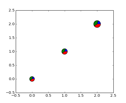
This example makes custom 'pie charts' as the markers for a scatter plotqu
Thanks to Manuel Metz for the example
"""
import math
import numpy as np
import matplotlib.pyplot as plt
# first define the ratios
r1 = 0.2 # 20%
r2 = r1 + 0.4 # 40%
# define some sizes of the scatter marker
sizes = [60,80,120]
# calculate the points of the first pie marker
#
# these are just the origin (0,0) +
# some points on a circle cos,sin
x = [0] + np.cos(np.linspace(0, 2*math.pi*r1, 10)).tolist()
y = [0] + np.sin(np.linspace(0, 2*math.pi*r1, 10)).tolist()
xy1 = list(zip(x,y))
# ...
x = [0] + np.cos(np.linspace(2*math.pi*r1, 2*math.pi*r2, 10)).tolist()
y = [0] + np.sin(np.linspace(2*math.pi*r1, 2*math.pi*r2, 10)).tolist()
xy2 = list(zip(x,y))
x = [0] + np.cos(np.linspace(2*math.pi*r2, 2*math.pi, 10)).tolist()
y = [0] + np.sin(np.linspace(2*math.pi*r2, 2*math.pi, 10)).tolist()
xy3 = list(zip(x,y))
fig, ax = plt.subplots()
ax.scatter( np.arange(3), np.arange(3), marker=(xy1,0), s=sizes, facecolor='blue' )
ax.scatter( np.arange(3), np.arange(3), marker=(xy2,0), s=sizes, facecolor='green' )
ax.scatter( np.arange(3), np.arange(3), marker=(xy3,0), s=sizes, facecolor='red' )
plt.show()
Keywords: python, matplotlib, pylab, example, codex (see Search examples)