
(Source code, png, hires.png, pdf)
"""
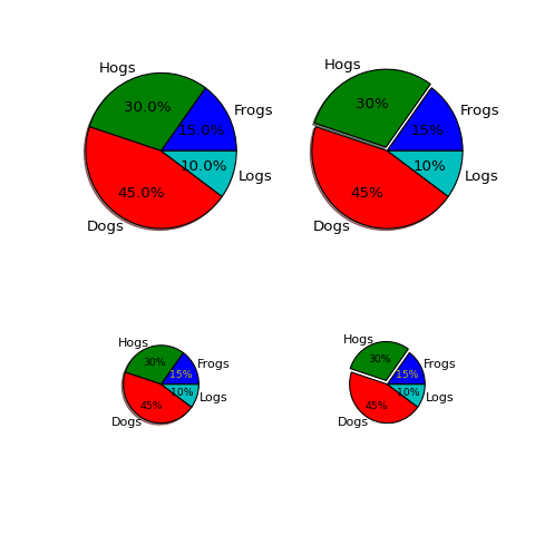
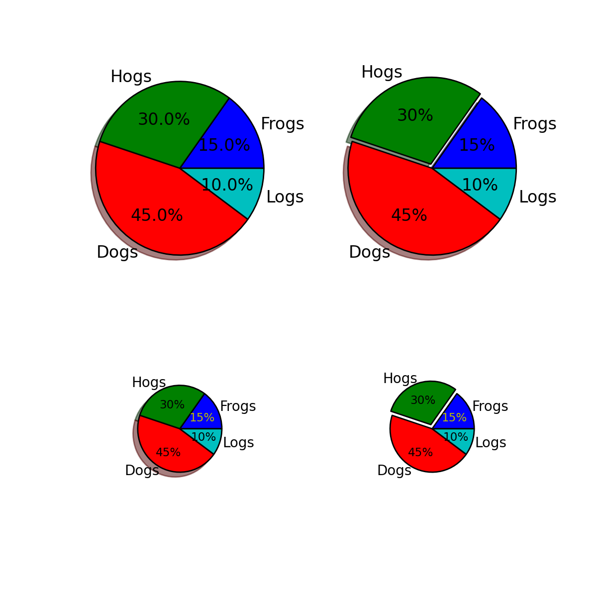
Make a pie charts of varying size - see
http://matplotlib.sf.net/matplotlib.pylab.html#-pie for the docstring.
This example shows a basic pie charts with labels optional features,
like autolabeling the percentage, offsetting a slice with "explode"
and adding a shadow, in different sizes.
"""
from pylab import *
from matplotlib.gridspec import GridSpec
# Some data
labels = 'Frogs', 'Hogs', 'Dogs', 'Logs'
fracs = [15,30,45, 10]
explode=(0, 0.05, 0, 0)
# Make square figures and axes
the_grid = GridSpec(2, 2)
figure(1, figsize=(6,6))
subplot(the_grid[0, 0])
pie(fracs, labels=labels, autopct='%1.1f%%', shadow=True)
subplot(the_grid[0, 1])
pie(fracs, explode=explode, labels=labels, autopct='%.0f%%', shadow=True)
subplot(the_grid[1, 0])
patches, texts, autotexts = pie(fracs, labels=labels,
autopct='%.0f%%',
shadow=True, radius=0.5)
# Make the labels on the small plot easier to read.
for t in texts:
t.set_size('smaller')
for t in autotexts:
t.set_size('x-small')
autotexts[0].set_color('y')
subplot(the_grid[1, 1])
patches, texts, autotexts = pie(fracs, explode=explode,
labels=labels, autopct='%.0f%%',
shadow=False, radius=0.5)
# Turn off shadow for tiny plot
# with exploded slice.
for t in texts:
t.set_size('smaller')
for t in autotexts:
t.set_size('x-small')
autotexts[0].set_color('y')
show()
Keywords: python, matplotlib, pylab, example, codex (see Search examples)