
(Source code, png, hires.png, pdf)

#!/usr/bin/env python
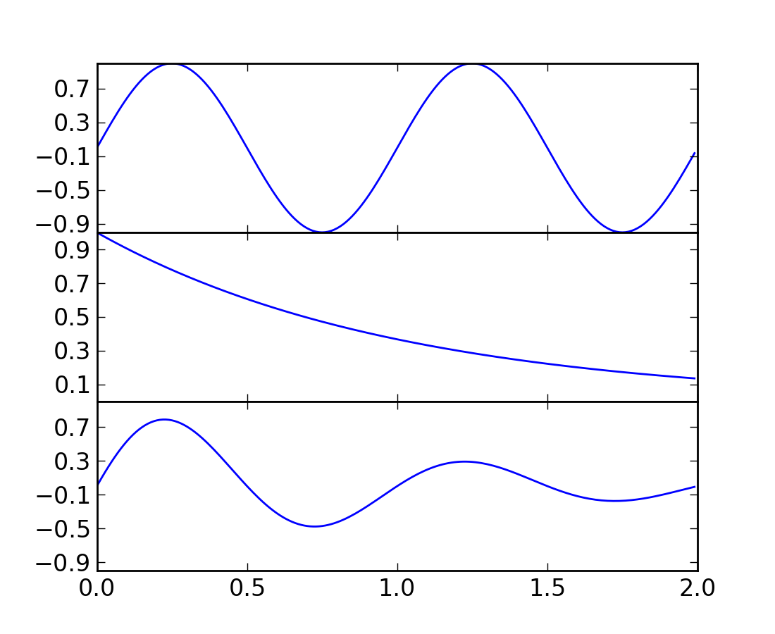
"""
To create plots that share a common axes (visually) you can set the
hspace between the subplots close to zero (do not use zero itself).
Normally you'll want to turn off the tick labels on all but one of the
axes.
In this example the plots share a common xaxis but you can follow the
same logic to supply a common y axis.
"""
from pylab import *
t = arange(0.0, 2.0, 0.01)
s1 = sin(2*pi*t)
s2 = exp(-t)
s3 = s1*s2
# axes rect in relative 0,1 coords left, bottom, width, height. Turn
# off xtick labels on all but the lower plot
f = figure()
subplots_adjust(hspace=0.001)
ax1 = subplot(311)
ax1.plot(t,s1)
yticks(arange(-0.9, 1.0, 0.4))
ylim(-1,1)
ax2 = subplot(312, sharex=ax1)
ax2.plot(t,s2)
yticks(arange(0.1, 1.0, 0.2))
ylim(0,1)
ax3 = subplot(313, sharex=ax1)
ax3.plot(t,s3)
yticks(arange(-0.9, 1.0, 0.4))
ylim(-1,1)
xticklabels = ax1.get_xticklabels()+ax2.get_xticklabels()
setp(xticklabels, visible=False)
show()
Keywords: python, matplotlib, pylab, example, codex (see Search examples)