
(Source code, png, hires.png, pdf)
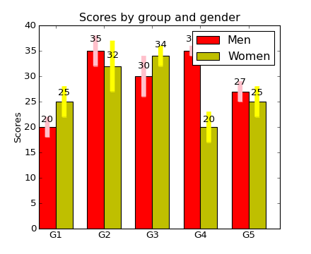
#!/usr/bin/env python
import numpy as np
import matplotlib.pyplot as plt

N = 5
menMeans = (20, 35, 30, 35, 27)
menStd =   (2, 3, 4, 1, 2)

ind = np.arange(N)  # the x locations for the groups
width = 0.35       # the width of the bars


plt.subplot(111)
rects1 = plt.bar(ind, menMeans, width,
                    color='r',
                    yerr=menStd,
                    error_kw=dict(elinewidth=6, ecolor='pink'))

womenMeans = (25, 32, 34, 20, 25)
womenStd =   (3, 5, 2, 3, 3)
rects2 = plt.bar(ind+width, womenMeans, width,
                    color='y',
                    yerr=womenStd,
                    error_kw=dict(elinewidth=6, ecolor='yellow'))

# add some
plt.ylabel('Scores')
plt.title('Scores by group and gender')
plt.xticks(ind+width, ('G1', 'G2', 'G3', 'G4', 'G5') )

plt.legend( (rects1[0], rects2[0]), ('Men', 'Women') )

def autolabel(rects):
    # attach some text labels
    for rect in rects:
        height = rect.get_height()
        plt.text(rect.get_x()+rect.get_width()/2., 1.05*height, '%d'%int(height),
                ha='center', va='bottom')

autolabel(rects1)
autolabel(rects2)

plt.show()
Keywords: python, matplotlib, pylab, example, codex (see Search examples)