Getting started with mpl-probscale
Installation
mpl-probscale is developed on Python 3.6. It is also tested on
Python 3.4, 3.5, and even 2.7 (for the time being).
From conda
Official releases of mpl-probscale can be found on conda-forge:
conda install --channel=conda-forge mpl-probscale
Fairly recent builds of the development verions are available on my channel:
conda install --channel=conda-forge mpl-probscale
From PyPI
Official source releases are also available on PyPI
pip install probscale
From source
mpl-probscale is a pure python package. It should be fairly trivial
to install from source on any platform. To do that, download or clone
from github, unzip the
archive if necessary then do:
cd mpl-probscale # or wherever the setup.py got placed
pip install .
I recommend pip install . over python setup.py install for
reasons I don’t fully
understand.
%matplotlib inline
import warnings
warnings.simplefilter('ignore')

import numpy
from matplotlib import pyplot
from scipy import stats
import seaborn

clear_bkgd = {'axes.facecolor':'none', 'figure.facecolor':'none'}
seaborn.set(style='ticks', context='talk', color_codes=True, rc=clear_bkgd)
Background
Built-in matplotlib scales
To the casual user, you can set matplotlib scales to either “linear” or “log” (logarithmic). There are others (e.g., logit, symlog), but I haven’t seen them too much in the wild.
Linear scales are the default:
fig, ax = pyplot.subplots()
seaborn.despine(fig=fig)
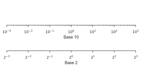
Logarithmic scales can work well when your data cover several orders of magnitude and don’t have to be in base 10.
fig, (ax1, ax2) = pyplot.subplots(nrows=2, figsize=(8,3))
ax1.set_xscale('log')
ax1.set_xlim(left=1e-3, right=1e3)
ax1.set_xlabel("Base 10")
ax1.set_yticks([])

ax2.set_xscale('log', basex=2)
ax2.set_xlim(left=2**-3, right=2**3)
ax2.set_xlabel("Base 2")
ax2.set_yticks([])

seaborn.despine(fig=fig, left=True)
Probabilty Scales
mpl-probscale lets you use probability scales. All you need to do is
import it.
Before importing, there is no probability scale available in matplotlib:
try:
    fig, ax = pyplot.subplots()
    ax.set_xscale('prob')
except ValueError as e:
    pyplot.close(fig)
    print(e)
Unknown scale type 'prob'
To access probability scales, simply import the probscale module.
import probscale
fig, ax = pyplot.subplots(figsize=(8, 3))
ax.set_xscale('prob')
ax.set_xlim(left=0.5, right=99.5)
ax.set_xlabel('Normal probability scale (%)')
seaborn.despine(fig=fig)
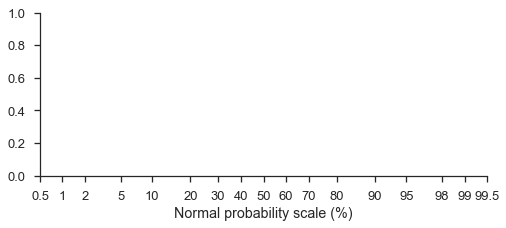
Probability scales default to the standard normal distribution (note that the formatting is a percentage-based probability)
You can even use different probability distributions, though it can be
tricky. You have to pass a frozen distribution from either
scipy.stats
or paramnormal to the
dist kwarg in ax.set_[x|y]scale.
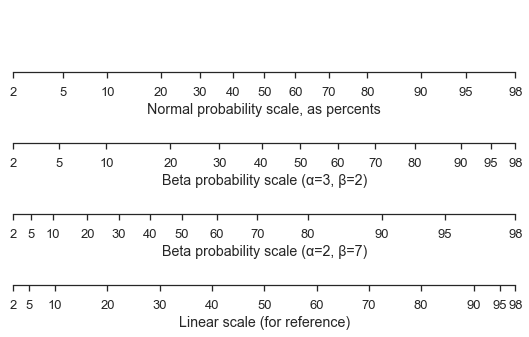
Here’s a standard normal scale with two different beta scales and a linear scale for comparison.
fig, (ax1, ax2, ax3, ax4) = pyplot.subplots(figsize=(9, 5), nrows=4)

for ax in [ax1, ax2, ax3, ax4]:
    ax.set_xlim(left=2, right=98)
    ax.set_yticks([])

ax1.set_xscale('prob')
ax1.set_xlabel('Normal probability scale, as percents')

beta1 = stats.beta(a=3, b=2)
ax2.set_xscale('prob', dist=beta1)
ax2.set_xlabel('Beta probability scale (α=3, β=2)')

beta2 = stats.beta(a=2, b=7)
ax3.set_xscale('prob', dist=beta2)
ax3.set_xlabel('Beta probability scale (α=2, β=7)')

ax4.set_xticks(ax1.get_xticks()[12:-12])
ax4.set_xlabel('Linear scale (for reference)')

seaborn.despine(fig=fig, left=True)
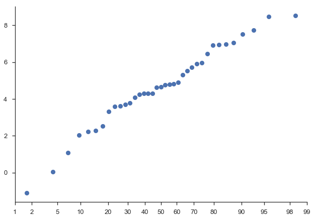
Ready-made probability plots
mpl-probscale ships with a small viz module that can help you
make a probability plot of a sample.
With only the sample data, probscale.probplot will create a figure,
compute the plotting position and non-exceedance probabilities, and plot
everything:
numpy.random.seed(0)
sample = numpy.random.normal(loc=4, scale=2, size=37)

fig = probscale.probplot(sample)
seaborn.despine(fig=fig)
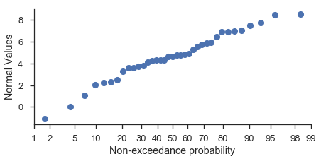
You should specify the matplotlib axes on which the plot should occur if you want to customize the plot using matplotlib commands directly:
fig, ax = pyplot.subplots(figsize=(7, 3))

probscale.probplot(sample, ax=ax)

ax.set_ylabel('Normal Values')
ax.set_xlabel('Non-exceedance probability')
ax.set_xlim(left=1, right=99)
seaborn.despine(fig=fig)
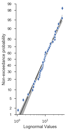
Lots of other options are directly accessible from the probplot
function signature.
fig, ax = pyplot.subplots(figsize=(3, 7))

numpy.random.seed(0)
new_sample = numpy.random.lognormal(mean=2.0, sigma=0.75, size=37)

probscale.probplot(
    new_sample,
    ax=ax,
    probax='y', # flip the plot
    datascale='log', # scale of the non-probability axis
    bestfit=True, # draw a best-fit line
    estimate_ci=True,
    datalabel='Lognormal Values',  # labels and markers...
    problabel='Non-exceedance probability',
    scatter_kws=dict(marker='d', zorder=2, mew=1.25, mec='w', markersize=10),
    line_kws=dict(color='0.17', linewidth=2.5, zorder=0, alpha=0.75),
)

ax.set_ylim(bottom=1, top=99)
seaborn.despine(fig=fig)
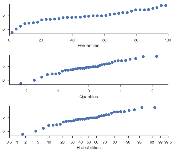
Percentile and Quanitile plots
For convenience, you can do percetile and quantile plots with the same function.
Note
The percentile and probability axes are plotted against the same values. The difference is only that “percentiles” are plotted on a linear scale.
fig, (ax1, ax2, ax3) = pyplot.subplots(nrows=3, figsize=(8, 7))

probscale.probplot(sample, ax=ax1, plottype='pp', problabel='Percentiles')
probscale.probplot(sample, ax=ax2, plottype='qq', problabel='Quantiles')
probscale.probplot(sample, ax=ax3, plottype='prob', problabel='Probabilities')

ax2.set_xlim(left=-2.5, right=2.5)
ax3.set_xlim(left=0.5, right=99.5)
fig.tight_layout()
seaborn.despine(fig=fig)
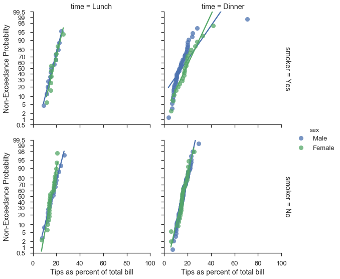
Working with seaborn FacetGrids
Good news, everyone. The probplot function generally works as
expected with
FacetGrids.
plot = (
    seaborn.load_dataset("tips")
        .assign(pct=lambda df: 100 * df['tip'] / df['total_bill'])
        .pipe(seaborn.FacetGrid, hue='sex', col='time', row='smoker', margin_titles=True, aspect=1., size=4)
        .map(probscale.probplot, 'pct', bestfit=True, scatter_kws=dict(alpha=0.75), probax='y')
        .add_legend()
        .set_ylabels('Non-Exceedance Probabilty')
        .set_xlabels('Tips as percent of total bill')
        .set(ylim=(0.5, 99.5), xlim=(0, 100))
)