
(Source code, png, hires.png, pdf)
#!/usr/bin/env python
from __future__ import print_function
"""
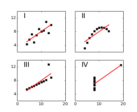
Edward Tufte uses this example from Anscombe to show 4 datasets of x
and y that have the same mean, standard deviation, and regression
line, but which are qualitatively different.
matplotlib fun for a rainy day
"""
from pylab import *
x = array([10, 8, 13, 9, 11, 14, 6, 4, 12, 7, 5])
y1 = array([8.04, 6.95, 7.58, 8.81, 8.33, 9.96, 7.24, 4.26, 10.84, 4.82, 5.68])
y2 = array([9.14, 8.14, 8.74, 8.77, 9.26, 8.10, 6.13, 3.10, 9.13, 7.26, 4.74])
y3 = array([7.46, 6.77, 12.74, 7.11, 7.81, 8.84, 6.08, 5.39, 8.15, 6.42, 5.73])
x4 = array([8,8,8,8,8,8,8,19,8,8,8])
y4 = array([6.58,5.76,7.71,8.84,8.47,7.04,5.25,12.50,5.56,7.91,6.89])
def fit(x):
return 3+0.5*x
xfit = array( [amin(x), amax(x) ] )
subplot(221)
plot(x,y1,'ks', xfit, fit(xfit), 'r-', lw=2)
axis([2,20,2,14])
setp(gca(), xticklabels=[], yticks=(4,8,12), xticks=(0,10,20))
text(3,12, 'I', fontsize=20)
subplot(222)
plot(x,y2,'ks', xfit, fit(xfit), 'r-', lw=2)
axis([2,20,2,14])
setp(gca(), xticklabels=[], yticks=(4,8,12), yticklabels=[], xticks=(0,10,20))
text(3,12, 'II', fontsize=20)
subplot(223)
plot(x,y3,'ks', xfit, fit(xfit), 'r-', lw=2)
axis([2,20,2,14])
text(3,12, 'III', fontsize=20)
setp(gca(), yticks=(4,8,12), xticks=(0,10,20))
subplot(224)
xfit = array([amin(x4),amax(x4)])
plot(x4,y4,'ks', xfit, fit(xfit), 'r-', lw=2)
axis([2,20,2,14])
setp(gca(), yticklabels=[], yticks=(4,8,12), xticks=(0,10,20))
text(3,12, 'IV', fontsize=20)
#verify the stats
pairs = (x,y1), (x,y2), (x,y3), (x4,y4)
for x,y in pairs:
print ('mean=%1.2f, std=%1.2f, r=%1.2f'%(mean(y), std(y), corrcoef(x,y)[0][1]))
show()
Keywords: python, matplotlib, pylab, example, codex (see Search examples)