
(Source code, png, hires.png, pdf)

#Initial idea from David Warde-Farley on the SciPy Cookbook
import numpy as np
import matplotlib.pyplot as plt
from matplotlib.patches import Rectangle
from matplotlib.ticker import NullLocator
#from matplotlib.collections import RegularPolyCollection
#from matplotlib.colors import BoundaryNorm, ListedColormap
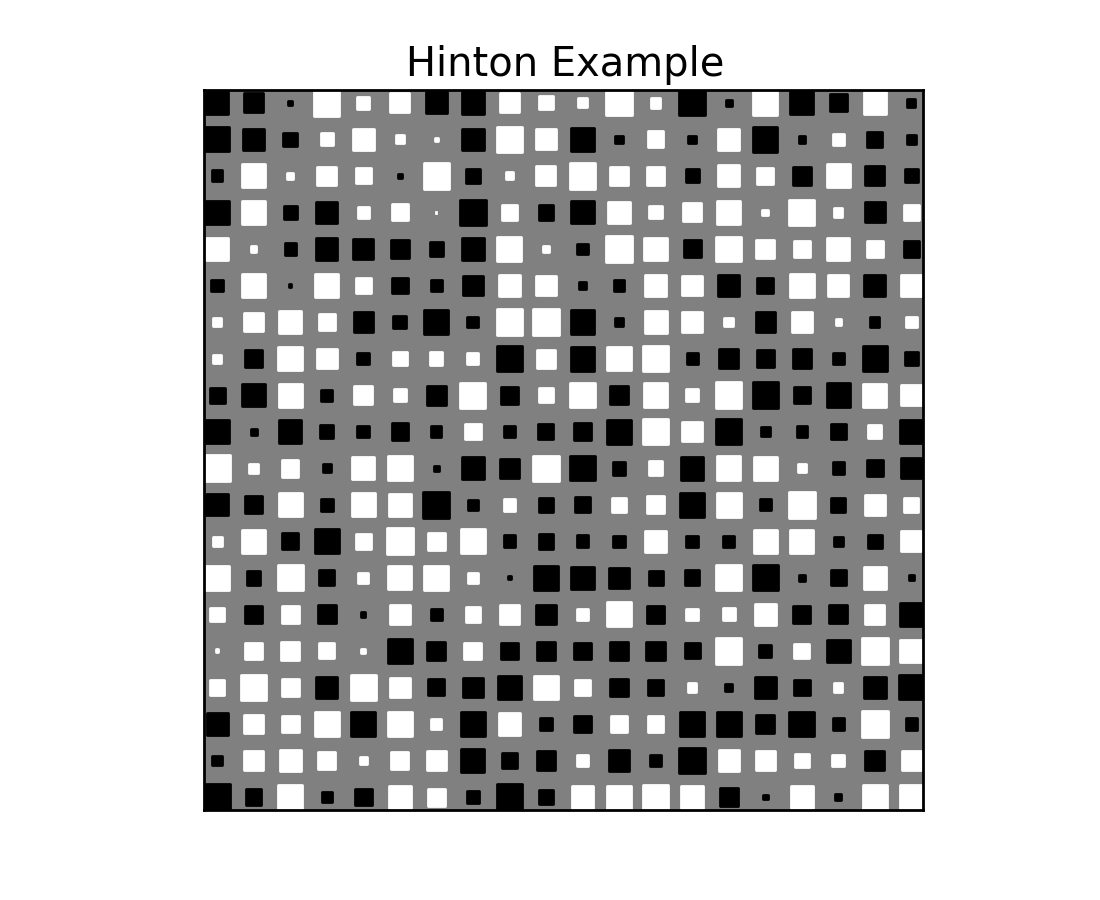
def hinton(W, maxWeight=None, ax=None):
"""
Draws a Hinton diagram for visualizing a weight matrix.
"""
if not ax:
fig = plt.figure()
ax = fig.add_subplot(1, 1, 1)
if not maxWeight:
maxWeight = 2**np.ceil(np.log(np.abs(W).max())/np.log(2))
ax.patch.set_facecolor('gray')
ax.set_aspect('equal', 'box')
ax.xaxis.set_major_locator(NullLocator())
ax.yaxis.set_major_locator(NullLocator())
for (x,y),w in np.ndenumerate(W):
if w > 0: color = 'white'
else: color = 'black'
size = np.sqrt(np.abs(w))
rect = Rectangle([x - size / 2, y - size / 2], size, size,
facecolor=color, edgecolor=color)
ax.add_patch(rect)
ax.autoscale_view()
# Reverse the yaxis limits
ax.set_ylim(*ax.get_ylim()[::-1])
## Potential way using polygon collections that just has an issue with
## easily getting the squares scaled by the data.
# height,width = W.shape
# x = np.arange(width)
# y = np.arange(height)
# X,Y = np.meshgrid(x, y)
# xy = np.array([X.flatten(),Y.flatten()]).T
# scaled_data = W.flatten() / maxWeight
# cmap = ListedColormap(['black', 'white'])
# norm = BoundaryNorm([-1., 0., 1.], cmap.N)
# rect_col = RegularPolyCollection(4, rotation=np.pi/4,
# sizes=np.abs(scaled_data) * 72 / ax.figure.get_dpi(), offsets=xy,
# transOffset=ax.transData, norm=norm, cmap=cmap, edgecolor='none')
# ax.add_collection(rect_col)
# rect_col.set_array(scaled_data)
# ax.autoscale_view()
if __name__ == '__main__':
hinton(np.random.rand(20, 20) - 0.5)
plt.title('Hinton Example')
plt.show()
Keywords: python, matplotlib, pylab, example, codex (see Search examples)